While listening to the audiobook of The Aleppo Codex, one small section struck me as strange. Here's my attempt to get to the bottom of it.
http://bdenckla.bitbucket.org/BQZCGKXk6x/
19 February 2015
04 December 2014
What would Amos do?
This is just a quick follow-up to my "What would Isaiah do?" post.
I was struck by an excerpt from chapter 5 of Amos that I saw in "A Lament for Eric Garner" on Aryeh Cohen's Justice in the City blog.
Two selections from Amos made it into the prophetic lectionary (haftarot), but not this one.
Nonetheless, I thought it was great, and it felt very much in line with the excerpt I used from chapter 58 of Isaiah in my post.
Here's the JPS translation:
[21] I loathe, I spurn your festivals,
I am not appeased by your solemn assemblies.
[22] If you offer Me burnt offerings—or your meal offerings—
I will not accept them;
I will pay no heed To your gifts of fatlings.
[23] Spare Me the sound of your hymns,
And let Me not hear the music of your lutes.
[24] But let justice well up like water,
Righteousness like an unfailing stream.
The JPS is a bit different, in its details, from the (unidentified) translation Aryeh Cohen uses, but not different in spirit.
The Isaiah of chapter 58 is generally agreed to have lived far after and far away from the Isaiah of chapter 1, who identifies himself as the son of Amos. Nonetheless, we see here that this Deutero-Isaiah is a worthy literary heir to Amos.
Note that this passage from Amos, like the one from Isaiah, could be interpreted as a rejection of the ritual aspects of Judaism in favor of its ethical aspects. In my opinion such an interpretation is neither reflective of the past nor is it helpful for the present. In other words, Isaiah and Amos railed against rituals as meaningless when practiced in isolation from Jewish ethics. This criticism is as relevant in our time as it was in theirs.
Perhaps more interesting, though, is the question, is ethical behavior any less meaningful when practiced in isolation from ritual? Or, more generally, what is the relationship, if any, between the ritual and the ethical? Does ritual somehow inform, motivate, or amplify our ethical behavior?
All I can say is that these questions are important to struggle with rather than dismiss.
04 November 2014
Ebooks are Software
Publishers have converted a huge number of their books into ebook form over the past few years.
Here are some reasons they might have done these conversions.
I used to rail against low-quality conversion, to whoever would listen: mostly my poor wife, since she's more or less a captive audience.
Then I had a humbling realization: publishers did exactly the right thing, in opting for low-quality conversion.
But I haven't become too humble: I think they did the right thing for the wrong reason.
They think they converted cheaply and now they're done.
I think they did the right thing to convert cheaply, but they should just view those conversions as version 1.0.
Another way of putting this is that publishers need to start treating ebooks as software, since ebooks are software.
To be fair, nothing in their previous, paper-based business would have prepared publishers to understand the dynamics of software.
Heck, software is such a young, changing field, that half of the software companies out there don't understand the dynamics of software. So why would I expect publishers to do better?
Then again, as Kohelet reminds us Jews every Sukkot, there is nothing new under the sun.
Publishers have, over the last four centuries or so, developed quality control processes that
So, publishers don't know anything about the particulars of software, but they do know something about quality control of initial releases and managing bug fixes in subsequent releases.
In paper publishing, a release is analogous to a printing.
Quality control of an initial release, in publishing, includes processes such as proofreading, possibly done multiple times on proofs of increasing finality. Managing bug fixes in subsequent releases includes processes such as receiving reported typos and fixing those that merit fixing.
One might think that publishers' quality process savvy would have ported well to the world of ebooks.
Sadly, this could hardly be farther from the truth.
As far as I can tell, these quality control processes almost never happen to ebooks. This is especially puzzling in the case of bug fixes, since the ebook medium drastically lowers the cost of reporting and fixing typos.
Paper books don't have a button allowing a reader to report a typo to the publisher. But, Kindle books might as well not have such a button, since, in my experience, publishers hardly ever act on such reports. I made hundreds of such reports before realizing that it is virtually pointless to do so.
To fix a typo in a paper book, a publisher has to not only fix the typo but wait for the next printing, which may never happen if the book's popularity falls off. In contrast, for an ebook, there is no such thing as a printing, only releases. A new release can be made at whatever frequency the publisher deems appropriate. Too bad virtually none of them seem to take advantage of this capability.
But, let's get back to my major theme here: low quality conversion.
If the initial conversions of ebooks had not been of such low quality, the typo correction process would not be so important.
But, as I must calmly remind myself when I start foaming at the mouth, I'm now trying to give publishers the benefit of the doubt, admitting that an initial low quality conversion was the right thing to do.
Low quality conversion allowed publishers to quickly enter a new market with low initial investment. What's not to love about that?
So, is all I'm advocating that publishers take reported typos seriously and start releasing 1.1 versions?
No.
I'd like to advocate for something more radical.
Yes, start taking typos more seriously, but, even more importantly:
It's time for version 2.0. In other words, it is time to re-convert, the right way. Or at least a better way.
It may be painful for publishers to hear this, since most are still in the middle of, or have just completed, the conversion of their back catalog. (Luckily, I don't think publishers or anyone else reads my blog, so these painful words will not be heard.)
In software, it is not at all painful to hear that what you do when you complete version 1.0 is you get to work on the next version. In fact, there is often a pipelined development process where work on 2.0 is already well underway when version 1.0 is released!
These 2.0 versions should
I've already talked about quality a lot, but this "be modern" admonition takes up a theme I briefly introduced above but then dropped: software needs to evolve with changes in its environment.
"Be modern" means no more concessions to the limitations of early e-readers. Publishers need to make the same hard calls that software companies make, with respect to leaving certain users behind who do not (or cannot) upgrade their hardware or software. Perhaps Amazon and other vendors could ease those users' pain by still making the old version available, but I know of no current mechanism for this. In the big picture, I'm sorry to say it but publishers can't let a few users cause their books to be stranded in a format that was the right thing for one particular time but is not the right thing, going forward.
Here I'm going out on a limb, but I think ebooks are where books are heading. I'm not saying that paper books will die. They will probably always have a place. But I think that in the future, the roles of paper books and ebooks will flip: the ebook will be viewed as the canonical version of the book, and the paper book will be viewed as a convenient alternate form of this canonical version. If I'm right about this, the initial, quick-and-dirty conversions that publishers have done are not appropriate for a lasting, canonical encoding of a book.
Some of the concessions to the limitations of early e-readers that are my pet peeves are as follows.
Here are some reasons they might have done these conversions.
- They believed that ebooks would be profitable, especially if low-quality conversion was done, making their fixed costs negligible.
- They were skeptical that ebooks would be profitable, but low-quality conversion was so cheap that it was worth hedging their bets.
- They feared Amazon's reprisal against their paper sales if they failed to get on board with Kindle.
I used to rail against low-quality conversion, to whoever would listen: mostly my poor wife, since she's more or less a captive audience.
Then I had a humbling realization: publishers did exactly the right thing, in opting for low-quality conversion.
But I haven't become too humble: I think they did the right thing for the wrong reason.
They think they converted cheaply and now they're done.
I think they did the right thing to convert cheaply, but they should just view those conversions as version 1.0.
Another way of putting this is that publishers need to start treating ebooks as software, since ebooks are software.
- Software has bugs that need to be fixed.
- Software needs to evolve as its environment changes.
To be fair, nothing in their previous, paper-based business would have prepared publishers to understand the dynamics of software.
Heck, software is such a young, changing field, that half of the software companies out there don't understand the dynamics of software. So why would I expect publishers to do better?
Then again, as Kohelet reminds us Jews every Sukkot, there is nothing new under the sun.
Publishers have, over the last four centuries or so, developed quality control processes that
- result in low initial defect rates and
- allow for fixing the few defects that do creep in.
So, publishers don't know anything about the particulars of software, but they do know something about quality control of initial releases and managing bug fixes in subsequent releases.
In paper publishing, a release is analogous to a printing.
Quality control of an initial release, in publishing, includes processes such as proofreading, possibly done multiple times on proofs of increasing finality. Managing bug fixes in subsequent releases includes processes such as receiving reported typos and fixing those that merit fixing.
One might think that publishers' quality process savvy would have ported well to the world of ebooks.
Sadly, this could hardly be farther from the truth.
As far as I can tell, these quality control processes almost never happen to ebooks. This is especially puzzling in the case of bug fixes, since the ebook medium drastically lowers the cost of reporting and fixing typos.
Paper books don't have a button allowing a reader to report a typo to the publisher. But, Kindle books might as well not have such a button, since, in my experience, publishers hardly ever act on such reports. I made hundreds of such reports before realizing that it is virtually pointless to do so.
To fix a typo in a paper book, a publisher has to not only fix the typo but wait for the next printing, which may never happen if the book's popularity falls off. In contrast, for an ebook, there is no such thing as a printing, only releases. A new release can be made at whatever frequency the publisher deems appropriate. Too bad virtually none of them seem to take advantage of this capability.
But, let's get back to my major theme here: low quality conversion.
If the initial conversions of ebooks had not been of such low quality, the typo correction process would not be so important.
But, as I must calmly remind myself when I start foaming at the mouth, I'm now trying to give publishers the benefit of the doubt, admitting that an initial low quality conversion was the right thing to do.
Low quality conversion allowed publishers to quickly enter a new market with low initial investment. What's not to love about that?
So, is all I'm advocating that publishers take reported typos seriously and start releasing 1.1 versions?
No.
I'd like to advocate for something more radical.
Yes, start taking typos more seriously, but, even more importantly:
It's time for version 2.0. In other words, it is time to re-convert, the right way. Or at least a better way.
It may be painful for publishers to hear this, since most are still in the middle of, or have just completed, the conversion of their back catalog. (Luckily, I don't think publishers or anyone else reads my blog, so these painful words will not be heard.)
In software, it is not at all painful to hear that what you do when you complete version 1.0 is you get to work on the next version. In fact, there is often a pipelined development process where work on 2.0 is already well underway when version 1.0 is released!
These 2.0 versions should
- Be high quality, e.g. avoid OCR if possible
- Be modern, i.e. avoid concessions to the limitations of early e-readers
"Be modern" means no more concessions to the limitations of early e-readers. Publishers need to make the same hard calls that software companies make, with respect to leaving certain users behind who do not (or cannot) upgrade their hardware or software. Perhaps Amazon and other vendors could ease those users' pain by still making the old version available, but I know of no current mechanism for this. In the big picture, I'm sorry to say it but publishers can't let a few users cause their books to be stranded in a format that was the right thing for one particular time but is not the right thing, going forward.
Here I'm going out on a limb, but I think ebooks are where books are heading. I'm not saying that paper books will die. They will probably always have a place. But I think that in the future, the roles of paper books and ebooks will flip: the ebook will be viewed as the canonical version of the book, and the paper book will be viewed as a convenient alternate form of this canonical version. If I'm right about this, the initial, quick-and-dirty conversions that publishers have done are not appropriate for a lasting, canonical encoding of a book.
Some of the concessions to the limitations of early e-readers that are my pet peeves are as follows.
- Images used instead of Unicode.
- Raster images (e.g. JPEGs) used instead of vector images (e.g. SVG).
- Failure to take advantage of various EPUB 3 features.
I guess this is sort of an abrupt ending, but that's it for now.
The web needs inkscale images
Web browsers are missing an important feature I call inkscale.
Inkscale is like grayscale, but instead of varying from black to white, it varies from its context's background color to its context's foreground color.
Inkscale should also support transparency, in which case it would vary from transparent to its context's foreground color.
The problem that inkscale solves is keeping an image's color scale in sync with the page's surrounding text colors.
Inkscale could be implemented by extending an existing image format, in which case no extension to HTML or CSS would be needed, though web browsers would need to be upgraded to interpret this new feature of, for example, PNG.
Alternately, inkscale could be implemented by extending HTML, perhaps as a new attribute of the IMG element that would instruct the browser to "deliberately misinterpret" a grayscale image as inkscale. Or it could be implemented in CSS.
My particular motivation for wanting inkscale is ebooks. Ebooks readers are basically specialized web browsers, since the two most commercially important ebook formats are the following.
So whereas the lack of inkscale in web pages is primarily an inconvenience for web designers, the lack of inkscale in ebooks is an inconvenience for end users. For example, consider these following two different "statements of pain."


SVG inside HTML already supports inkscale images, for vector elements, i.e. strokes and fills. E.g. an SVG element's "fill" property can be set to the SVG variable "currentColor," which is the current HTML/CSS foreground (text) color. What is not clear to me is whether SVG can be coaxed to transform raster images according to currentColor.
Inkscale is like grayscale, but instead of varying from black to white, it varies from its context's background color to its context's foreground color.
Inkscale should also support transparency, in which case it would vary from transparent to its context's foreground color.
The problem that inkscale solves is keeping an image's color scale in sync with the page's surrounding text colors.
Inkscale could be implemented by extending an existing image format, in which case no extension to HTML or CSS would be needed, though web browsers would need to be upgraded to interpret this new feature of, for example, PNG.
Alternately, inkscale could be implemented by extending HTML, perhaps as a new attribute of the IMG element that would instruct the browser to "deliberately misinterpret" a grayscale image as inkscale. Or it could be implemented in CSS.
My particular motivation for wanting inkscale is ebooks. Ebooks readers are basically specialized web browsers, since the two most commercially important ebook formats are the following.
- EPUB, which is based on HTML
- Kindle (MOBI/KF8), which is usually generated from EPUB
So whereas the lack of inkscale in web pages is primarily an inconvenience for web designers, the lack of inkscale in ebooks is an inconvenience for end users. For example, consider these following two different "statements of pain."
- Web designer: "Argh! We can't redo the color scheme without re-generating our images!"
- Ebook end user: "Argh! I like black-on-beige text but it makes this book's images stick out like a sore thumb, since the images are stuck as black-on-white!"
Another reason that inkscale is particularly important for ebooks is that many ebooks encode non-Latin characters as images, since unfortunately for a long time many ebook readers did not have Unicode support. It is particularly jarring when such "text-only images" do not match the foreground and background colors of the surrounding text.
Here are some examples of problems created by the lack of inkscale in ebooks. These are screen snips from the Kindle for PC ebook reader. I show each example two ways. First, I show it with a problematic color scheme (white-on-black or brown-on-beige) and then I show it with the black-on-white color scheme, in which case there is no problem.
Finally, a few random concluding notes and questions.
AutoCAD's bitonal images feature is a bit like inkscale.
SVG inside HTML already supports inkscale images, for vector elements, i.e. strokes and fills. E.g. an SVG element's "fill" property can be set to the SVG variable "currentColor," which is the current HTML/CSS foreground (text) color. What is not clear to me is whether SVG can be coaxed to transform raster images according to currentColor.
Fonts can, somewhat perversely, be thought of as special-purpose inkscale images. In some sense, this is what has created the whole problem: if fonts weren't inkscale, we wouldn't need inkscale to match text colors!
On the flip side, fonts can, somewhat perversely, be used to allow inkscale on the web today. The idea is, somewhat perversely, to encode the images that need to be inkscale as glyphs in a custom font. (This may not be so perverse if the images are in fact being used to overcome character set limitations, e.g. spotty Unicode support.)
The End.
Update: a friend who shall remain nameless found the following Stack Overflow discussion of how to implement something close to inkscale:
The closest thing to inkscale, at the moment, seems to be the CSS "filter" property, e.g. as described here:
and
The "filter" property (in its webkit-specific form) is intriguingly demonstrated here:
and here:
I may be missing something, but it seems like the "filter" property, though offering something close to inkscale, isn't there yet.
In particular, the "filter" property offers grayscale() and sepia(), but inkscale support (at least as I have defined it) would require something like inkscale(). I.e. grayscale() and sepia() are mapping the image along two specific background/foreground scales, rather than mapping the image along a "current background" to "current foreground" scale.
Here's a follow-up post I made on the topic of this "inkscale" feature.
Here's a follow-up post I made on the topic of this "inkscale" feature.
23 October 2014
Ebooks for Reform Jews
Since I've been trying, mostly without success, to get work creating high-quality ebooks of interest to Reform Jews, I was curious to survey the state of that business.
I decided, somewhat arbitrarily, that I would use the following data as a proxy for the state of ebooks of interest to Reform Jews.
I took as my sample the list of previously recommended non-fiction books from the URJs list of Significant Jewish Books.
Then, for each of these books, I created a row in a Google Spreadsheet with the following data.
Of course, this data is only a proxy for what I really want to get at. I am using URJ's list as a proxy for the vague (and much broader) notion of "books of interest to Reform Jews." And, less dubiously, I am using Amazon paper and Kindle sales as a proxy for all paper and ebook sales.
This data collection turned out to be surprisingly tricky in many cases. Amazon isn't called Amazon for nothing: it is a jungle of not-that-well-organized data. In particular, for many books, it is not clear whether a Kindle edition exists, because a link to the Kindle edition is not provided from some or all of the pages showing a paper edition. In one case, the Kindle edition was only available for a previous edition of the book, which had a slightly different title! So you have to do a careful, separate search for a Kindle edition if one seems to not exist.
Anyway, enough of my kvetching, and on to the results.
Kindle editions are available for 31 out of the 50 books (62% of the books). As to what the quality of these Kindle editions is, I have my doubts. In my experience, Kindle ebooks vary greatly in quality, but all are lower quality (e.g. have more typos) than their paper counterparts.
Somewhat surprisingly, there doesn't seem to be a strong relationship between the rank of the paper book and the presence of an ebook. I would have expected publishers to be more pragmatic in their choice of which titles they have chosen to convert from their back catalog, letting worse-ranked titles languish in paper-only obscurity.
The best-ranking paper book without an ebook was Primo Levi's The Periodic Table. Its paper rank was 30,845.
On the other hand, of the 15 books whose rank was worse than (i.e. higher than) 500,000, about half (8 of them) were available as ebooks!
Perhaps low-quality ebook conversion is so cheap that publishers don't worry about a paper book's low performance too much in deciding whether to convert it to be an ebook. What factors they do consider in making the decision, I would love to know.
In four cases I deem significant, ebooks actually out-rank their paper counterparts.
Still, for lack of a better metric, comparing ebook rank to paper book rank is interesting.
In my spreadsheet, I've used orange as the background color for all cases in which the ebook has a better rank than its paper counterpart.
I only consider the four best-ranked cases of this to be significant since I assume that down in the poor-performing end of the rank distribution (let's say, rank worse than (i.e. higher than) 500,000), there is a lot of noise.
I decided, somewhat arbitrarily, that I would use the following data as a proxy for the state of ebooks of interest to Reform Jews.
I took as my sample the list of previously recommended non-fiction books from the URJs list of Significant Jewish Books.
Then, for each of these books, I created a row in a Google Spreadsheet with the following data.
- The Amazon sales rank for the best-ranking paper version of that book.
- The Amazon sales rank for the Kindle version of that book, if it existed.
Of course, this data is only a proxy for what I really want to get at. I am using URJ's list as a proxy for the vague (and much broader) notion of "books of interest to Reform Jews." And, less dubiously, I am using Amazon paper and Kindle sales as a proxy for all paper and ebook sales.
This data collection turned out to be surprisingly tricky in many cases. Amazon isn't called Amazon for nothing: it is a jungle of not-that-well-organized data. In particular, for many books, it is not clear whether a Kindle edition exists, because a link to the Kindle edition is not provided from some or all of the pages showing a paper edition. In one case, the Kindle edition was only available for a previous edition of the book, which had a slightly different title! So you have to do a careful, separate search for a Kindle edition if one seems to not exist.
Anyway, enough of my kvetching, and on to the results.
Kindle editions are available for 31 out of the 50 books (62% of the books). As to what the quality of these Kindle editions is, I have my doubts. In my experience, Kindle ebooks vary greatly in quality, but all are lower quality (e.g. have more typos) than their paper counterparts.
Somewhat surprisingly, there doesn't seem to be a strong relationship between the rank of the paper book and the presence of an ebook. I would have expected publishers to be more pragmatic in their choice of which titles they have chosen to convert from their back catalog, letting worse-ranked titles languish in paper-only obscurity.
The best-ranking paper book without an ebook was Primo Levi's The Periodic Table. Its paper rank was 30,845.
On the other hand, of the 15 books whose rank was worse than (i.e. higher than) 500,000, about half (8 of them) were available as ebooks!
Perhaps low-quality ebook conversion is so cheap that publishers don't worry about a paper book's low performance too much in deciding whether to convert it to be an ebook. What factors they do consider in making the decision, I would love to know.
In four cases I deem significant, ebooks actually out-rank their paper counterparts.
- A Tale of Love and Darkness
- The Man in the White Sharkskin Suit
- The Beggar King and the Secret of Happiness: A True Story
- The Israelis: Ordinary People in an Extraordinary Land
Still, for lack of a better metric, comparing ebook rank to paper book rank is interesting.
In my spreadsheet, I've used orange as the background color for all cases in which the ebook has a better rank than its paper counterpart.
I only consider the four best-ranked cases of this to be significant since I assume that down in the poor-performing end of the rank distribution (let's say, rank worse than (i.e. higher than) 500,000), there is a lot of noise.
17 October 2014
More on bitonal (inkscale) images
Here are a four updates to my previous post.


- Rename: "inkscale" instead of "bitonal"
- Web icons show the demand for inkscale
- Harry Potter examples
- Proposals to standards committees
1. Rename: "inkscale" instead of "bitonal." The mental model is a single-color printing process, i.e. one color of ink on some color of paper. I also considered, but rejected, "foreground-scale" and "currentColor-scale."
2. Web icons show the demand for inkscale. In my previous post, I mentioned two ways of implementing inkscale using today's standards. One way is fonts, and the other way is SVG. What I did not mention is that this is not just a theoretical capability: people are widely implementing icons for their websites using both of these technologies.
Nonetheless, I can't help but feel that the font approach is fundamentally a hack, not a real, long-term solution. And, while the SVG approach feels better, it fails to address raster images. This failure is not much of a problem in the realm of icons, since raster icons are probably best avoided anyway!
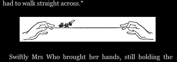
3. Harry Potter examples. There are many cases where you would not want to use inkscale. For example, most grayscale photographs should be rendered as grayscale, not inkscale. But there are many drawings for which the decision requires a careful judgment call.
Take, for example, the following screen snip from the beginning of a Harry Potter chapter:
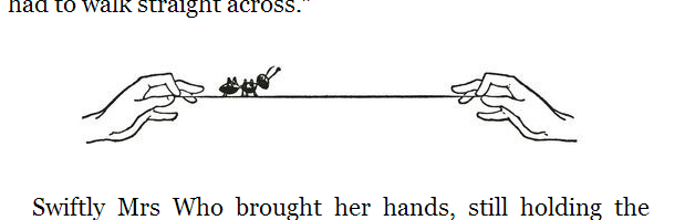
Though this doesn't look great, the problem is only made worse by converting to inkscale (which, in this case, means inverting):
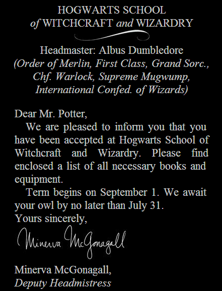
To reaffirm your faith that there are many examples where inkscale is a clear win, here's another screen snip:
And here it is with its two images converted to inkscale:
Here's my guess at a general guideline for whether to convert to inkscale or not: If the intensity values of the image have meaning, don't pervert this meaning by converting to inkscale.
For example, the Hagrid image above is not a line drawing: it uses intensity (shading) to indicate something about the implied color of its objects and the implied source(s) of lighting. It implies that his boots are dark, and that they are lit from the left.
Whereas, in the letter, the swoosh and the signature are not real, lit objects. Or rather, we are to imagine them as real objects, but we do not seek to represent them as such.
One rough version of the guideline would be the following. If the image should really have been represented in a vector format like SVG, it should probably be inkscale. Whereas, if it is appropriately represented in a raster format, it should probably stay grayscale. I'm sure there are many exceptions to this, e.g. an elaborately shaded SVG image.
Even though it takes us beyond the ideas of inkscale, I can't resist suggesting that it could be an interesting added value to the ebook if the signature appeared in a slightly different color than the text. Doing this in the paper book would presumably introduce a big increase in marginal cost, but of course in an ebook, it would have only the fixed cost of figuring out how to implement it. To satisfy the color-scheme flexibility that is in the spirit of inkscale, we might like to define the color of the signature as a slightly hue-rotated version of the text color. If the text color has no hue, i.e. is black or white, we might give it a slightly blue hue. This way, in the standard black-on-white color scheme, mimicking black ink on white paper, the signature would appear to be in dark blue ink.
4. Proposals to standards committees. I've submitted the inkscale idea for consideration as part of the next revision of EPUB and for consideration for inclusion in the CSS filter effects module.
02 October 2014
What would Isaiah do?
[This was originally a post I made on facebook in response to the article, "Orthodox Man Refuses To Sit Next to Feminist Activist on Airplane."]
Christians sometimes ask themselves, "What would Jesus do?" In what could be thought of as a Jewish analogy to this question, Heschel challenges all Jews to ask themselves: would your Judaism be intelligible to Isaiah [1]? In other words, "What would the Hebrew prophets have you do?"
The Hebrew prophets teach us that, in analogy to God's limitless concern for us, there should be no limit to our concern for others.
This means that mitzvot should never be observed in isolation of concern for others.
Thus, even if I grant that avoiding contact with a member of the opposite sex is a mitzvah, it cannot be observed in isolation, i.e. it cannot be observed without considering how it causes others to feel.
We are approaching Yom Kippur. Consider what Isaiah has to say, in the haftarah for YK morning, about the mitzvah of fasting, if observed in isolation of concern for others:
Particularly resonant with the airplane issue is Isaiah's idea of "never withdrawing yourself from your own kin."
What would Isaiah have done, had he been on that plane?
Notes
1. The quote from Heschel I have in mind is the following, from "To Be a Jew: What Is It?" in Moral Grandeur and Spiritual Audacity, p. 9.
Christians sometimes ask themselves, "What would Jesus do?" In what could be thought of as a Jewish analogy to this question, Heschel challenges all Jews to ask themselves: would your Judaism be intelligible to Isaiah [1]? In other words, "What would the Hebrew prophets have you do?"
The Hebrew prophets teach us that, in analogy to God's limitless concern for us, there should be no limit to our concern for others.
This means that mitzvot should never be observed in isolation of concern for others.
Thus, even if I grant that avoiding contact with a member of the opposite sex is a mitzvah, it cannot be observed in isolation, i.e. it cannot be observed without considering how it causes others to feel.
We are approaching Yom Kippur. Consider what Isaiah has to say, in the haftarah for YK morning, about the mitzvah of fasting, if observed in isolation of concern for others:
58:5. Is this the fast I have chosen?
A day of self-affliction?
Bowing your head like a reed,
and covering yourself with sackcloth and ashes?
Is this what you call a fast,
a day acceptable to the Eternal?
6. Is not this the fast that I have chosen:
to unlock the shackles of injustice,
to loosen the ropes of the yoke,
to let the oppressed go free,
and to tear every yoke apart?
7. Surely it is to share your bread with the hungry,
and to bring the homeless poor into your house;
when you see the naked, to cover them,
never withdrawing yourself from your own kin.
8. Then shall your light break forth like the dawn,
and your healing shall quickly blossom;
your Righteous One will walk before you,
the glory of the Eternal will be your rear guard.
9. Then, when you call,(Translation by Chaim Stern.)
the Eternal will answer;
when you cry, God will say: Here I am.
Particularly resonant with the airplane issue is Isaiah's idea of "never withdrawing yourself from your own kin."
What would Isaiah have done, had he been on that plane?
Notes
1. The quote from Heschel I have in mind is the following, from "To Be a Jew: What Is It?" in Moral Grandeur and Spiritual Audacity, p. 9.
Our way of life must remain to some degree intelligible to Isaiah and Rabbi Yochanan ben Zakkai, to Maimonides and the Baal Shem.
Subscribe to:
Posts (Atom)