- Rename: "inkscale" instead of "bitonal"
- Web icons show the demand for inkscale
- Harry Potter examples
- Proposals to standards committees
1. Rename: "inkscale" instead of "bitonal." The mental model is a single-color printing process, i.e. one color of ink on some color of paper. I also considered, but rejected, "foreground-scale" and "currentColor-scale."
2. Web icons show the demand for inkscale. In my previous post, I mentioned two ways of implementing inkscale using today's standards. One way is fonts, and the other way is SVG. What I did not mention is that this is not just a theoretical capability: people are widely implementing icons for their websites using both of these technologies.
Nonetheless, I can't help but feel that the font approach is fundamentally a hack, not a real, long-term solution. And, while the SVG approach feels better, it fails to address raster images. This failure is not much of a problem in the realm of icons, since raster icons are probably best avoided anyway!
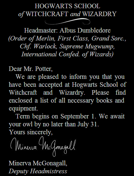
3. Harry Potter examples. There are many cases where you would not want to use inkscale. For example, most grayscale photographs should be rendered as grayscale, not inkscale. But there are many drawings for which the decision requires a careful judgment call.
Take, for example, the following screen snip from the beginning of a Harry Potter chapter:

Though this doesn't look great, the problem is only made worse by converting to inkscale (which, in this case, means inverting):

To reaffirm your faith that there are many examples where inkscale is a clear win, here's another screen snip:

And here it is with its two images converted to inkscale:
Here's my guess at a general guideline for whether to convert to inkscale or not: If the intensity values of the image have meaning, don't pervert this meaning by converting to inkscale.
For example, the Hagrid image above is not a line drawing: it uses intensity (shading) to indicate something about the implied color of its objects and the implied source(s) of lighting. It implies that his boots are dark, and that they are lit from the left.
Whereas, in the letter, the swoosh and the signature are not real, lit objects. Or rather, we are to imagine them as real objects, but we do not seek to represent them as such.
One rough version of the guideline would be the following. If the image should really have been represented in a vector format like SVG, it should probably be inkscale. Whereas, if it is appropriately represented in a raster format, it should probably stay grayscale. I'm sure there are many exceptions to this, e.g. an elaborately shaded SVG image.
Even though it takes us beyond the ideas of inkscale, I can't resist suggesting that it could be an interesting added value to the ebook if the signature appeared in a slightly different color than the text. Doing this in the paper book would presumably introduce a big increase in marginal cost, but of course in an ebook, it would have only the fixed cost of figuring out how to implement it. To satisfy the color-scheme flexibility that is in the spirit of inkscale, we might like to define the color of the signature as a slightly hue-rotated version of the text color. If the text color has no hue, i.e. is black or white, we might give it a slightly blue hue. This way, in the standard black-on-white color scheme, mimicking black ink on white paper, the signature would appear to be in dark blue ink.
4. Proposals to standards committees. I've submitted the inkscale idea for consideration as part of the next revision of EPUB and for consideration for inclusion in the CSS filter effects module.
No comments:
Post a Comment