This post only exists to provide a link to its new location.
It can be found here with its new title.
11 September 2014

30 June 2014
Ebooks from Sources
Here’s a link to a minimal, work-in progress web site advertising my ebook consulting services: http://bdenckla.github.io/efs/.
01 May 2014
The Prophet Lorax

One of the most profitable aspects of my Jewish journey has been learning about the Hebrew Prophets, particularly the Latter Prophets. A basic but ongoing challenge to that learning is just trying to understand what a prophet is in our tradition.
Initially, like many people, I thought that the main feature of a prophet is his prediction of the future. In other words, I viewed a prophet as a seer.
But, now I think the main feature of a prophet is his seeing the present more clearly than other people. A prophet's predictions of the future serve only to emphasize his points about the present. To exhort people to change their behavior now, a prophet predicts rewards and punishments.
Although the behaviors the prophet wants to change are often personal, the rewards and punishments he predicts are usually societal, or even global. This system of reward and punishment that the prophet predicts may not appeal to us, or it may appeal to us but seem a naive fantasy. Either way, it may be a "turn-off."
I want to encourage people to get turned back on to the prophets. To that end, I think it may help to view the predicted rewards and punishments as only tactics that the prophets use to achieve goals of the good and the holy.
So, though these tactics may not appeal to us, I earnestly hope that the goals still do.
Particularly at risk is the goal of the holy. The goal of the good is one respected and pursued by many. Good is of course always threatened by evil. And, nowadays, it is threatened by a relativism that has made the categories of good and evil unfashionable. But the greater threat is to the concept of the holy, which is so out of fashion in some circles, and so perverted in others, that I fear for its survival.
A prophet speaks inconvenient truths to try to make us good and make us holy. He also offers us hope that this daunting task can indeed be done.
Another journey I'm on is raising kids. One of them got The Lorax by Dr. Seuss as a birthday present. As I read it to them, I realized, hey, this guy The Lorax is a prophet!
Well, maybe he's not a prophet, if that seems blasphemous to you, but at least he's a darn good (and fun) illustration of the most important features of a prophet.
I won't review the book here, but suffice it to say that the Lorax spoke inconvenient truths to try to make the Once-ler good. In the end it is the Once-ler, not the Lorax, who offers hope, though, in the form of a seed.
The idea of the holy is missing, or, rather, must be supplied by the reader. Perhaps it is better that way.
The idea of divine inspiration is missing, too. It is missing both from the Lorax and from my discussion of prophets. Perhaps it is better that way.
In closing, let me provide a couple of links showing other people's exploration of the idea of the Lorax as a prophet.
The Lorax, the Prophets, and the iPad
The Lorax and Deuteronomy
09 August 2013
My People's Giant Passover Haggadah
Thanks to the suggestion of Rabbi Joel Nickerson, I have been enjoying My People's Passover Haggadah: Traditional Texts, Modern Commentaries (henceforth MPPH).
It got me thinking about the design challenges of Jewish books.
Like many Jewish books, MPPH contains many related texts.
So a design challenge of such a book is to use resources such as layout and font to show how its texts are related. Making these relationships clear makes it easier for the reader to know his or her location within the complex structure of such a book. And it makes it easier for the reader to navigate within such a book.
A Talmud is a great example of such a book. Take a look at this neat PDF (by Joshua Parker) to get a sense of how a Talmud addresses the challenges of presenting multiple related texts.
Part II of MPPH is a sequence of sections. Each section contains a number of elements. The elements are of the following types and "multiplicities" (how many are expected).
MPPH uses various techniques to show how the elements of a section are related.
The most notable technique it uses is what I will call the anchor spread. (I'm using "spread" to mean two facing pages.)
Here is an example. (I've provided it only at low resolution since I'm only interested in the layout, not the content.)

At the center of the spread is the beginning of the Haggadah passage in question, with English on the left and Hebrew/Aramaic on the right.
Surrounding the passage and its translation are the beginnings of the commentaries. Each commentary beginning is followed by an indication of the page on which the rest of the commentary appears. This indication is also known as a jump line or continuation line. (The Haggadah passage itself has no jump line since it continues immediately after the anchor spread.)
So in some ways the anchor spread resembles the first page of a newspaper section on which many articles are started, but most or all need to be finished elsewhere.
The anchor spread design got me thinking... what if jumps were not needed, i.e. what if the complete commentaries surrounded the complete Haggadah passage?
I.e. what would it be like if you could really see where you were within the "landscape" of the section?
To partly answer this question, I did the following.
 Here's the result (bill shown for scale):

Here's a link to a redacted PDF version of it on Scribd. This version is redacted to avoid copyright infringement. (Hopefully the picture of the un-redacted version above is low enough resolution to avoid anyone considering this copyright infringement.)
That was fun, but many questions remain. Could you do the whole book this way? How would you bind, or otherwise package, such a giant book? As a flip chart on an easel?
About ten years ago, Michael Hawley published the world's biggest book (at least at that time). I wonder what could be learned from that experience.
Going in a different direction, how can this "jumpless" large format experience be emulated (or improved upon!) digitally? A goal being, how can you, as seamlessly as possbile, zoom out to see structure, and zoom in to view content in detail, without losing a sense of your place within the structure?
I'm sure smart people have come up with interesting approaches to such problems and look forward to learning more about them. Perhaps I'll report what I find out in a subsequent post.
It got me thinking about the design challenges of Jewish books.
Like many Jewish books, MPPH contains many related texts.
So a design challenge of such a book is to use resources such as layout and font to show how its texts are related. Making these relationships clear makes it easier for the reader to know his or her location within the complex structure of such a book. And it makes it easier for the reader to navigate within such a book.
A Talmud is a great example of such a book. Take a look at this neat PDF (by Joshua Parker) to get a sense of how a Talmud addresses the challenges of presenting multiple related texts.
Part II of MPPH is a sequence of sections. Each section contains a number of elements. The elements are of the following types and "multiplicities" (how many are expected).
- 1 Haggadah passage (Hebrew and/or Aramaic)
- 1 Translation of the Haggadah passage into English
- 1 Summary of the meaning of the passage (a "signpost")
- 0..n Ceremonial instructions, each belonging to a location within the Haggadah passage
- 0..n Images
- 8..11 Commentaries on the passage
MPPH uses various techniques to show how the elements of a section are related.
The most notable technique it uses is what I will call the anchor spread. (I'm using "spread" to mean two facing pages.)
Here is an example. (I've provided it only at low resolution since I'm only interested in the layout, not the content.)

At the center of the spread is the beginning of the Haggadah passage in question, with English on the left and Hebrew/Aramaic on the right.
Surrounding the passage and its translation are the beginnings of the commentaries. Each commentary beginning is followed by an indication of the page on which the rest of the commentary appears. This indication is also known as a jump line or continuation line. (The Haggadah passage itself has no jump line since it continues immediately after the anchor spread.)
So in some ways the anchor spread resembles the first page of a newspaper section on which many articles are started, but most or all need to be finished elsewhere.
The anchor spread design got me thinking... what if jumps were not needed, i.e. what if the complete commentaries surrounded the complete Haggadah passage?
I.e. what would it be like if you could really see where you were within the "landscape" of the section?
To partly answer this question, I did the following.
- I extracted the elements of the "4 questions section" from a digital version of MPPH. I hope I didn't break any laws (or breach any contracts) in the process. Just in case, I will not reveal the details of how I did this. I'm sure what I did was ethical, but of course ethics and the law are not always aligned.
- I laid these elements out on a single giant page using the Scribus open source desktop publishing software.
- For $10.90, I had a print shop print this out for me on a large-format printer, something like the following.

Here's a link to a redacted PDF version of it on Scribd. This version is redacted to avoid copyright infringement. (Hopefully the picture of the un-redacted version above is low enough resolution to avoid anyone considering this copyright infringement.)
That was fun, but many questions remain. Could you do the whole book this way? How would you bind, or otherwise package, such a giant book? As a flip chart on an easel?
About ten years ago, Michael Hawley published the world's biggest book (at least at that time). I wonder what could be learned from that experience.
Going in a different direction, how can this "jumpless" large format experience be emulated (or improved upon!) digitally? A goal being, how can you, as seamlessly as possbile, zoom out to see structure, and zoom in to view content in detail, without losing a sense of your place within the structure?
I'm sure smart people have come up with interesting approaches to such problems and look forward to learning more about them. Perhaps I'll report what I find out in a subsequent post.
03 February 2013
How I made our computer quiet
One of the two (!) fans in our computer's power supply has been getting more and more raucous over the past few months. I don't know whether this means it was close to actually stopping, but it was certainly close to actually driving me crazy. So, somewhat out of character for me, I decided to finally try to do something about it. Big mistake.
I found the following three options for what to do.
A brief digression. I found it amusing to see, in an online discussion of what lubricant to use, a British person asking for the equivalent of "gun oil" since shops in his country don't commonly sell it, or sell guns, for that matter! (It was speculated that "sewing machine oil" would be similar.)
So I was determined to get a new power supply but not spend a huge amount of time figuring out what the best one would be. I fear I waste a lot of time shopping online for things, optimizing on margins that don't matter. Well it turns out it would have been worth spending some time figuring out what a correct one would have been, leaving aside the question of what the best one would have been.
I found some random site that offered a nice-looking lookup of power supply by computer name, and trusted it. Big mistake.
It turns out there has been a lot of evolution of the ATX power supply standard over the years. As is so often the case, there's a good Wikipedia article covering it. I only wish I had read it before plugging my new power supply in. (Digression: since it is so often the case that there is a good Wikipedia article about things, I've recently donated to Wikipedia, and plan to do so regularly, and encourage you to do so, too, if you find it useful.)
So, I plugged my new power supply in, and everything seemed fine, but when I came back a few hours later, there was a strange smell in the room and the computer was off and would not turn back on, even with the old-but-noisy power supply plugged back in. Woops.
So, making good on the promise implicit in the title of this post, that's how I made our computer quiet. Very quiet. One might even say silent.
I lack some combination of the skill and the inclination to figure out exactly what happened, but my not-too-wild guess is that you shouldn't plug a 20-pin power supply into a 24-pin motherboard. I guess I was hoping that if it wouldn't work, it just wouldn't work. Meaning, I hoped that if it wouldn't work, it would fail in the following three ways.
Well, it did fail obviously. But not immediately, and not non-destructively.
Was my wishful thinking a product of "overly digital" thinking? Though digital systems have plenty of non-obvious, non-immediate, destructive failure modes, somehow I think analog systems have even more.
And power supplies are about as analog as you can get. In fact, they're not even analog: they're power! Power is the analog of nothing! Or, put it this way, I've never heard of power being used as the analog of anything. Voltage, certainly. Current even, sometimes. But power, never.
Returning from that digression, my point is, that what probably happened is that things did work, initially, and then once something heated up, over time, something on the motherboard melted or burned.
It turns out that those 4 extra pins are supplying "redundant" 3.3, 5, and 12 V lines, as well as ground. Not having them forces the other pins to carry more than their "fair share" of the current. Unfortunately I guess the weak point in the system was on the motherboard, not in the power supply. Otherwise plugging the old power supply back in would have worked.
So then I set about spending several should-have-been-sleeping hours researching the current offerings of Dell and HP. In other words, my mistake has led me to the most wasteful option, the following implicit option number 4.
So, I'll be spending a little quality time over the next few days setting up a hopefully-nice new Windows 8 machine.
Still to be determined whether I will shell out $100 to upgrade from Windows 8 to Windows 8 Pro. I am curious to try to run Ubuntu under the "Hyper-V" virtualization built into Pro, but probably I should just save $100 and use VirtualBox, like I do with great success and ease on MacOS on my MacBook Pro.
Also, will we ever want to connect to the machine using Remote Desktop? For that, you need Pro.
Decisions, decisions.
But at least these decisions are back in the realm of software, where I feel more comfortable.
Because if there's one take-home lesson from this experience, it is that I shouldn't have felt comfortable in the realm of power. She is a cruel mistress, the analog of nothing.
I found the following three options for what to do.
- Lubricate the fan.
- Replace the fan.
- Replace the power supply.
A brief digression. I found it amusing to see, in an online discussion of what lubricant to use, a British person asking for the equivalent of "gun oil" since shops in his country don't commonly sell it, or sell guns, for that matter! (It was speculated that "sewing machine oil" would be similar.)
So I was determined to get a new power supply but not spend a huge amount of time figuring out what the best one would be. I fear I waste a lot of time shopping online for things, optimizing on margins that don't matter. Well it turns out it would have been worth spending some time figuring out what a correct one would have been, leaving aside the question of what the best one would have been.
I found some random site that offered a nice-looking lookup of power supply by computer name, and trusted it. Big mistake.
It turns out there has been a lot of evolution of the ATX power supply standard over the years. As is so often the case, there's a good Wikipedia article covering it. I only wish I had read it before plugging my new power supply in. (Digression: since it is so often the case that there is a good Wikipedia article about things, I've recently donated to Wikipedia, and plan to do so regularly, and encourage you to do so, too, if you find it useful.)
So, I plugged my new power supply in, and everything seemed fine, but when I came back a few hours later, there was a strange smell in the room and the computer was off and would not turn back on, even with the old-but-noisy power supply plugged back in. Woops.
So, making good on the promise implicit in the title of this post, that's how I made our computer quiet. Very quiet. One might even say silent.
I lack some combination of the skill and the inclination to figure out exactly what happened, but my not-too-wild guess is that you shouldn't plug a 20-pin power supply into a 24-pin motherboard. I guess I was hoping that if it wouldn't work, it just wouldn't work. Meaning, I hoped that if it wouldn't work, it would fail in the following three ways.
- obviously
- immediately
- non-destructively
Well, it did fail obviously. But not immediately, and not non-destructively.
Was my wishful thinking a product of "overly digital" thinking? Though digital systems have plenty of non-obvious, non-immediate, destructive failure modes, somehow I think analog systems have even more.
And power supplies are about as analog as you can get. In fact, they're not even analog: they're power! Power is the analog of nothing! Or, put it this way, I've never heard of power being used as the analog of anything. Voltage, certainly. Current even, sometimes. But power, never.
Returning from that digression, my point is, that what probably happened is that things did work, initially, and then once something heated up, over time, something on the motherboard melted or burned.
It turns out that those 4 extra pins are supplying "redundant" 3.3, 5, and 12 V lines, as well as ground. Not having them forces the other pins to carry more than their "fair share" of the current. Unfortunately I guess the weak point in the system was on the motherboard, not in the power supply. Otherwise plugging the old power supply back in would have worked.
So then I set about spending several should-have-been-sleeping hours researching the current offerings of Dell and HP. In other words, my mistake has led me to the most wasteful option, the following implicit option number 4.
- Replace entire computer.
So, I'll be spending a little quality time over the next few days setting up a hopefully-nice new Windows 8 machine.
Still to be determined whether I will shell out $100 to upgrade from Windows 8 to Windows 8 Pro. I am curious to try to run Ubuntu under the "Hyper-V" virtualization built into Pro, but probably I should just save $100 and use VirtualBox, like I do with great success and ease on MacOS on my MacBook Pro.
Also, will we ever want to connect to the machine using Remote Desktop? For that, you need Pro.
Decisions, decisions.
But at least these decisions are back in the realm of software, where I feel more comfortable.
Because if there's one take-home lesson from this experience, it is that I shouldn't have felt comfortable in the realm of power. She is a cruel mistress, the analog of nothing.
28 December 2012
The Chapman Exchange
I spotted the following use of the old "2L-5N" (2 letter, 5 number) dialing instructions on a sign on a fence at Rancho Park Golf Course in Los Angeles.

The sign advertises the Cyclone Fence Division of American Steel & Wire Co.
It also mentions United States Steel. Was American Steel & Wire Co. just a part of that (USS)?
Anyway, the address given is 5532 San Fernando Road, Glendale, Calif.
And the phone number, the reason for my interest, is CHapman 5-2635.
The sign also advertises locations in Oakland, San Francisco, Seattle, and Portland.
Though the use of 2L-5N is what most caught my attention, the typography is pretty neat, too. In particular, the big fat font used for the main text of "CYCLONE FENCE."
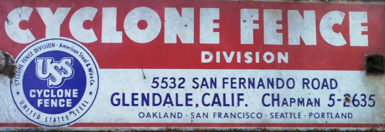
The sign advertises the Cyclone Fence Division of American Steel & Wire Co.
It also mentions United States Steel. Was American Steel & Wire Co. just a part of that (USS)?
Anyway, the address given is 5532 San Fernando Road, Glendale, Calif.
And the phone number, the reason for my interest, is CHapman 5-2635.
The sign also advertises locations in Oakland, San Francisco, Seattle, and Portland.
Though the use of 2L-5N is what most caught my attention, the typography is pretty neat, too. In particular, the big fat font used for the main text of "CYCLONE FENCE."
16 November 2012
Digitizing your books
Here's what I've learned so far about digitizing books for personal use.
 The scanning service I've tried is called 1DollarScan. It works well. For a base price of $1 per 100 pages, they will (destructively) turn your book into a PDF. They offer various extra services, each of which costs an additional $1 per 100 pages. Some of these extras are listed below.



I've tried storing PDFs on Dropbox, Google Drive, and Scribd. I think Google Drive is the best overall. Here is a comparison of what these services offer.
Or, you can compress your documents using Acrobat's ClearScan and then they will probably fit even Google's 25 Mb limit. So far, I haven't gotten Scribd to accept ClearScan files that were bigger than 100 Mb before they were compressed, though. My guess is that when they are converted to Scribd's format, they end up being too big again.
One thing I noticed about Scribd's viewer: it doesn't show you the full resolution of your document, at least not if it is 600 dpi. I suppose you can download the PDF if this is a problem, but that might be mildly annoying.
Unlike Scribd, Google Drive allows files greater than 100 Mb. But, a PDF bigger than 25 Mb won't be searched or shown in the built-in viewer. In other words it is just an opaque (dumb) bunch of bits.
Okay so that's what I have to share about my experiences digitizing books. What follows is a postscript on the narrow issue of how to fix PDF search on 64-bit Windows.
The reason, I discovered, to my horror, is that on 64-bit Windows, PDFs won't be indexed unless you install a special "IFilter" program from Adobe. Once I did this and rebuilt the index, PDF search started working.
In my opinion, this is really bush league stuff from an otherwise major league company like Adobe. Though a little weird, I respect their choice to not have a 64-bit version of Acrobat. The 32-bit version works fine and I suppose Acrobat is unlikely to require more than the 2 Gb or so of memory that would trigger the need for a 64-bit version. But, they should have figured out how to install this 64-bit IFilter thing along with the 32-bit application, when it is being installed on a 64-bit OS.
I try not to indulge in Windows-bashing or Mac booster-ism unless I have something specific to say. So I guess I'd modify the adage
How should you scan your documents?

- 600 dpi (instead of 300 dpi)
- Ship from Amazon.com. That way you can "pretend" any book on Amazon is available as a PDF!
- OCR. I gave it a try but was not particularly impressed. So now I plan to do the OCR myself using Acrobat. Acrobat has an amazing option called "ClearScan" that replaces recognized characters with their representation in a custom font. I'm still keeping the original scans for reference, in case ClearScan messes up, but so far it has offered me about 18x compression at what appears to be an increase in quality!
- Use book title as file name. I gave it a try, and it was fine, but now I plan to just name my files using their ISBN, e.g. "ISBN 1234567890". I plan to put the title and author in the PDF metadata. This keeps file names short, though it makes them unfriendly. I'm assuming this unfriendliness won't be a problem since I'll find things by searches of content as well as file name, where the content will include the title metadata as well as the OCR data for the images. If you do go with titles in file names, note that many titles can't be exactly represented as file names since they contain characters prohibited from file names. E.g. on Windows, a colon is prohibited, but it is a very common character separating title from subtitle! As one would expect, the title field of the PDF metadata has no such restrictions.
Now, where should you put your scanned PDF?

I've tried storing PDFs on Dropbox, Google Drive, and Scribd. I think Google Drive is the best overall. Here is a comparison of what these services offer.
- Dropbox
- No file size limit
- 2 Gb overall limit for free accounts
- Offline access
- Native viewers (Acrobat, Preview)
- Native search (Windows Explorer, Mac Finder)
- Google Drive
- 25 Mb file size limit for in-browser viewer and in-browser search
- 5 Gb overall limit for free accounts
- Offline access
- Native or in-browser viewer
- Native or in-browser search
- Scribd
- 100 Mb file size limit; much smaller for ClearScan?
- No overall space limit for free accounts
- No offline access
- In-browser viewer
- In-browser search
Or, you can compress your documents using Acrobat's ClearScan and then they will probably fit even Google's 25 Mb limit. So far, I haven't gotten Scribd to accept ClearScan files that were bigger than 100 Mb before they were compressed, though. My guess is that when they are converted to Scribd's format, they end up being too big again.
One thing I noticed about Scribd's viewer: it doesn't show you the full resolution of your document, at least not if it is 600 dpi. I suppose you can download the PDF if this is a problem, but that might be mildly annoying.
Unlike Scribd, Google Drive allows files greater than 100 Mb. But, a PDF bigger than 25 Mb won't be searched or shown in the built-in viewer. In other words it is just an opaque (dumb) bunch of bits.
Okay so that's what I have to share about my experiences digitizing books. What follows is a postscript on the narrow issue of how to fix PDF search on 64-bit Windows.
Postscript: How to fix PDF search on 64-bit Windows
One of the big advantages of having your books digitized with OCR is the ability to search within a book and among all your books. To my dismay, this was not working for me on Windows.The reason, I discovered, to my horror, is that on 64-bit Windows, PDFs won't be indexed unless you install a special "IFilter" program from Adobe. Once I did this and rebuilt the index, PDF search started working.
In my opinion, this is really bush league stuff from an otherwise major league company like Adobe. Though a little weird, I respect their choice to not have a 64-bit version of Acrobat. The 32-bit version works fine and I suppose Acrobat is unlikely to require more than the 2 Gb or so of memory that would trigger the need for a 64-bit version. But, they should have figured out how to install this 64-bit IFilter thing along with the 32-bit application, when it is being installed on a 64-bit OS.
I try not to indulge in Windows-bashing or Mac booster-ism unless I have something specific to say. So I guess I'd modify the adage
If you don't have anything nice to say, don't say anything at all.to
If you don't have anything specific to say, don't say anything at all.
Here I have something specific to say. Mac's built-in PDF support is nice. You get a viewer (Preview) and search right out of the box. On Windows, it is mildly annoying that one must install a viewer (usually Acrobat Reader) on each new machine, but it is close to infuriating that indexing (search) doesn't work even when you do that install! Without some intrepid Googling to figure out that this is a 64-bit problem, you won't be able to figure out why indexing works on some machines and not others. (The answer is that some machines are running 32-bit Windows and some machines are running 64-bit Windows!)
Subscribe to:
Posts (Atom)