While listening to the audiobook of The Aleppo Codex, one small section struck me as strange. Here's my attempt to get to the bottom of it.
http://bdenckla.bitbucket.org/BQZCGKXk6x/
19 February 2015

04 December 2014
What would Amos do?
This is just a quick follow-up to my "What would Isaiah do?" post.
I was struck by an excerpt from chapter 5 of Amos that I saw in "A Lament for Eric Garner" on Aryeh Cohen's Justice in the City blog.
Two selections from Amos made it into the prophetic lectionary (haftarot), but not this one.
Nonetheless, I thought it was great, and it felt very much in line with the excerpt I used from chapter 58 of Isaiah in my post.
Here's the JPS translation:
[21] I loathe, I spurn your festivals,
I am not appeased by your solemn assemblies.
[22] If you offer Me burnt offerings—or your meal offerings—
I will not accept them;
I will pay no heed To your gifts of fatlings.
[23] Spare Me the sound of your hymns,
And let Me not hear the music of your lutes.
[24] But let justice well up like water,
Righteousness like an unfailing stream.
I was struck by an excerpt from chapter 5 of Amos that I saw in "A Lament for Eric Garner" on Aryeh Cohen's Justice in the City blog.
Two selections from Amos made it into the prophetic lectionary (haftarot), but not this one.
Nonetheless, I thought it was great, and it felt very much in line with the excerpt I used from chapter 58 of Isaiah in my post.
Here's the JPS translation:
[21] I loathe, I spurn your festivals,
I am not appeased by your solemn assemblies.
[22] If you offer Me burnt offerings—or your meal offerings—
I will not accept them;
I will pay no heed To your gifts of fatlings.
[23] Spare Me the sound of your hymns,
And let Me not hear the music of your lutes.
[24] But let justice well up like water,
Righteousness like an unfailing stream.
The JPS is a bit different, in its details, from the (unidentified) translation Aryeh Cohen uses, but not different in spirit.
The Isaiah of chapter 58 is generally agreed to have lived far after and far away from the Isaiah of chapter 1, who identifies himself as the son of Amos. Nonetheless, we see here that this Deutero-Isaiah is a worthy literary heir to Amos.
Note that this passage from Amos, like the one from Isaiah, could be interpreted as a rejection of the ritual aspects of Judaism in favor of its ethical aspects. In my opinion such an interpretation is neither reflective of the past nor is it helpful for the present. In other words, Isaiah and Amos railed against rituals as meaningless when practiced in isolation from Jewish ethics. This criticism is as relevant in our time as it was in theirs.
Perhaps more interesting, though, is the question, is ethical behavior any less meaningful when practiced in isolation from ritual? Or, more generally, what is the relationship, if any, between the ritual and the ethical? Does ritual somehow inform, motivate, or amplify our ethical behavior?
All I can say is that these questions are important to struggle with rather than dismiss.
04 November 2014
Ebooks are Software
Publishers have converted a huge number of their books into ebook form over the past few years.
Here are some reasons they might have done these conversions.
I used to rail against low-quality conversion, to whoever would listen: mostly my poor wife, since she's more or less a captive audience.
Then I had a humbling realization: publishers did exactly the right thing, in opting for low-quality conversion.
But I haven't become too humble: I think they did the right thing for the wrong reason.
They think they converted cheaply and now they're done.
I think they did the right thing to convert cheaply, but they should just view those conversions as version 1.0.
Another way of putting this is that publishers need to start treating ebooks as software, since ebooks are software.
To be fair, nothing in their previous, paper-based business would have prepared publishers to understand the dynamics of software.
Heck, software is such a young, changing field, that half of the software companies out there don't understand the dynamics of software. So why would I expect publishers to do better?
Then again, as Kohelet reminds us Jews every Sukkot, there is nothing new under the sun.
Publishers have, over the last four centuries or so, developed quality control processes that
So, publishers don't know anything about the particulars of software, but they do know something about quality control of initial releases and managing bug fixes in subsequent releases.
In paper publishing, a release is analogous to a printing.
Quality control of an initial release, in publishing, includes processes such as proofreading, possibly done multiple times on proofs of increasing finality. Managing bug fixes in subsequent releases includes processes such as receiving reported typos and fixing those that merit fixing.
One might think that publishers' quality process savvy would have ported well to the world of ebooks.
Sadly, this could hardly be farther from the truth.
As far as I can tell, these quality control processes almost never happen to ebooks. This is especially puzzling in the case of bug fixes, since the ebook medium drastically lowers the cost of reporting and fixing typos.
Paper books don't have a button allowing a reader to report a typo to the publisher. But, Kindle books might as well not have such a button, since, in my experience, publishers hardly ever act on such reports. I made hundreds of such reports before realizing that it is virtually pointless to do so.
To fix a typo in a paper book, a publisher has to not only fix the typo but wait for the next printing, which may never happen if the book's popularity falls off. In contrast, for an ebook, there is no such thing as a printing, only releases. A new release can be made at whatever frequency the publisher deems appropriate. Too bad virtually none of them seem to take advantage of this capability.
But, let's get back to my major theme here: low quality conversion.
If the initial conversions of ebooks had not been of such low quality, the typo correction process would not be so important.
But, as I must calmly remind myself when I start foaming at the mouth, I'm now trying to give publishers the benefit of the doubt, admitting that an initial low quality conversion was the right thing to do.
Low quality conversion allowed publishers to quickly enter a new market with low initial investment. What's not to love about that?
So, is all I'm advocating that publishers take reported typos seriously and start releasing 1.1 versions?
No.
I'd like to advocate for something more radical.
Yes, start taking typos more seriously, but, even more importantly:
It's time for version 2.0. In other words, it is time to re-convert, the right way. Or at least a better way.
It may be painful for publishers to hear this, since most are still in the middle of, or have just completed, the conversion of their back catalog. (Luckily, I don't think publishers or anyone else reads my blog, so these painful words will not be heard.)
In software, it is not at all painful to hear that what you do when you complete version 1.0 is you get to work on the next version. In fact, there is often a pipelined development process where work on 2.0 is already well underway when version 1.0 is released!
These 2.0 versions should
I've already talked about quality a lot, but this "be modern" admonition takes up a theme I briefly introduced above but then dropped: software needs to evolve with changes in its environment.
"Be modern" means no more concessions to the limitations of early e-readers. Publishers need to make the same hard calls that software companies make, with respect to leaving certain users behind who do not (or cannot) upgrade their hardware or software. Perhaps Amazon and other vendors could ease those users' pain by still making the old version available, but I know of no current mechanism for this. In the big picture, I'm sorry to say it but publishers can't let a few users cause their books to be stranded in a format that was the right thing for one particular time but is not the right thing, going forward.
Here I'm going out on a limb, but I think ebooks are where books are heading. I'm not saying that paper books will die. They will probably always have a place. But I think that in the future, the roles of paper books and ebooks will flip: the ebook will be viewed as the canonical version of the book, and the paper book will be viewed as a convenient alternate form of this canonical version. If I'm right about this, the initial, quick-and-dirty conversions that publishers have done are not appropriate for a lasting, canonical encoding of a book.
Some of the concessions to the limitations of early e-readers that are my pet peeves are as follows.
Here are some reasons they might have done these conversions.
- They believed that ebooks would be profitable, especially if low-quality conversion was done, making their fixed costs negligible.
- They were skeptical that ebooks would be profitable, but low-quality conversion was so cheap that it was worth hedging their bets.
- They feared Amazon's reprisal against their paper sales if they failed to get on board with Kindle.
I used to rail against low-quality conversion, to whoever would listen: mostly my poor wife, since she's more or less a captive audience.
Then I had a humbling realization: publishers did exactly the right thing, in opting for low-quality conversion.
But I haven't become too humble: I think they did the right thing for the wrong reason.
They think they converted cheaply and now they're done.
I think they did the right thing to convert cheaply, but they should just view those conversions as version 1.0.
Another way of putting this is that publishers need to start treating ebooks as software, since ebooks are software.
- Software has bugs that need to be fixed.
- Software needs to evolve as its environment changes.
To be fair, nothing in their previous, paper-based business would have prepared publishers to understand the dynamics of software.
Heck, software is such a young, changing field, that half of the software companies out there don't understand the dynamics of software. So why would I expect publishers to do better?
Then again, as Kohelet reminds us Jews every Sukkot, there is nothing new under the sun.
Publishers have, over the last four centuries or so, developed quality control processes that
- result in low initial defect rates and
- allow for fixing the few defects that do creep in.
So, publishers don't know anything about the particulars of software, but they do know something about quality control of initial releases and managing bug fixes in subsequent releases.
In paper publishing, a release is analogous to a printing.
Quality control of an initial release, in publishing, includes processes such as proofreading, possibly done multiple times on proofs of increasing finality. Managing bug fixes in subsequent releases includes processes such as receiving reported typos and fixing those that merit fixing.
One might think that publishers' quality process savvy would have ported well to the world of ebooks.
Sadly, this could hardly be farther from the truth.
As far as I can tell, these quality control processes almost never happen to ebooks. This is especially puzzling in the case of bug fixes, since the ebook medium drastically lowers the cost of reporting and fixing typos.
Paper books don't have a button allowing a reader to report a typo to the publisher. But, Kindle books might as well not have such a button, since, in my experience, publishers hardly ever act on such reports. I made hundreds of such reports before realizing that it is virtually pointless to do so.
To fix a typo in a paper book, a publisher has to not only fix the typo but wait for the next printing, which may never happen if the book's popularity falls off. In contrast, for an ebook, there is no such thing as a printing, only releases. A new release can be made at whatever frequency the publisher deems appropriate. Too bad virtually none of them seem to take advantage of this capability.
But, let's get back to my major theme here: low quality conversion.
If the initial conversions of ebooks had not been of such low quality, the typo correction process would not be so important.
But, as I must calmly remind myself when I start foaming at the mouth, I'm now trying to give publishers the benefit of the doubt, admitting that an initial low quality conversion was the right thing to do.
Low quality conversion allowed publishers to quickly enter a new market with low initial investment. What's not to love about that?
So, is all I'm advocating that publishers take reported typos seriously and start releasing 1.1 versions?
No.
I'd like to advocate for something more radical.
Yes, start taking typos more seriously, but, even more importantly:
It's time for version 2.0. In other words, it is time to re-convert, the right way. Or at least a better way.
It may be painful for publishers to hear this, since most are still in the middle of, or have just completed, the conversion of their back catalog. (Luckily, I don't think publishers or anyone else reads my blog, so these painful words will not be heard.)
In software, it is not at all painful to hear that what you do when you complete version 1.0 is you get to work on the next version. In fact, there is often a pipelined development process where work on 2.0 is already well underway when version 1.0 is released!
These 2.0 versions should
- Be high quality, e.g. avoid OCR if possible
- Be modern, i.e. avoid concessions to the limitations of early e-readers
"Be modern" means no more concessions to the limitations of early e-readers. Publishers need to make the same hard calls that software companies make, with respect to leaving certain users behind who do not (or cannot) upgrade their hardware or software. Perhaps Amazon and other vendors could ease those users' pain by still making the old version available, but I know of no current mechanism for this. In the big picture, I'm sorry to say it but publishers can't let a few users cause their books to be stranded in a format that was the right thing for one particular time but is not the right thing, going forward.
Here I'm going out on a limb, but I think ebooks are where books are heading. I'm not saying that paper books will die. They will probably always have a place. But I think that in the future, the roles of paper books and ebooks will flip: the ebook will be viewed as the canonical version of the book, and the paper book will be viewed as a convenient alternate form of this canonical version. If I'm right about this, the initial, quick-and-dirty conversions that publishers have done are not appropriate for a lasting, canonical encoding of a book.
Some of the concessions to the limitations of early e-readers that are my pet peeves are as follows.
- Images used instead of Unicode.
- Raster images (e.g. JPEGs) used instead of vector images (e.g. SVG).
- Failure to take advantage of various EPUB 3 features.
I guess this is sort of an abrupt ending, but that's it for now.
The web needs inkscale images
Web browsers are missing an important feature I call inkscale.
Inkscale is like grayscale, but instead of varying from black to white, it varies from its context's background color to its context's foreground color.
Inkscale should also support transparency, in which case it would vary from transparent to its context's foreground color.
The problem that inkscale solves is keeping an image's color scale in sync with the page's surrounding text colors.
Inkscale could be implemented by extending an existing image format, in which case no extension to HTML or CSS would be needed, though web browsers would need to be upgraded to interpret this new feature of, for example, PNG.
Alternately, inkscale could be implemented by extending HTML, perhaps as a new attribute of the IMG element that would instruct the browser to "deliberately misinterpret" a grayscale image as inkscale. Or it could be implemented in CSS.
My particular motivation for wanting inkscale is ebooks. Ebooks readers are basically specialized web browsers, since the two most commercially important ebook formats are the following.
So whereas the lack of inkscale in web pages is primarily an inconvenience for web designers, the lack of inkscale in ebooks is an inconvenience for end users. For example, consider these following two different "statements of pain."


SVG inside HTML already supports inkscale images, for vector elements, i.e. strokes and fills. E.g. an SVG element's "fill" property can be set to the SVG variable "currentColor," which is the current HTML/CSS foreground (text) color. What is not clear to me is whether SVG can be coaxed to transform raster images according to currentColor.
Inkscale is like grayscale, but instead of varying from black to white, it varies from its context's background color to its context's foreground color.
Inkscale should also support transparency, in which case it would vary from transparent to its context's foreground color.
The problem that inkscale solves is keeping an image's color scale in sync with the page's surrounding text colors.
Inkscale could be implemented by extending an existing image format, in which case no extension to HTML or CSS would be needed, though web browsers would need to be upgraded to interpret this new feature of, for example, PNG.
Alternately, inkscale could be implemented by extending HTML, perhaps as a new attribute of the IMG element that would instruct the browser to "deliberately misinterpret" a grayscale image as inkscale. Or it could be implemented in CSS.
My particular motivation for wanting inkscale is ebooks. Ebooks readers are basically specialized web browsers, since the two most commercially important ebook formats are the following.
- EPUB, which is based on HTML
- Kindle (MOBI/KF8), which is usually generated from EPUB
So whereas the lack of inkscale in web pages is primarily an inconvenience for web designers, the lack of inkscale in ebooks is an inconvenience for end users. For example, consider these following two different "statements of pain."
- Web designer: "Argh! We can't redo the color scheme without re-generating our images!"
- Ebook end user: "Argh! I like black-on-beige text but it makes this book's images stick out like a sore thumb, since the images are stuck as black-on-white!"
Another reason that inkscale is particularly important for ebooks is that many ebooks encode non-Latin characters as images, since unfortunately for a long time many ebook readers did not have Unicode support. It is particularly jarring when such "text-only images" do not match the foreground and background colors of the surrounding text.
Here are some examples of problems created by the lack of inkscale in ebooks. These are screen snips from the Kindle for PC ebook reader. I show each example two ways. First, I show it with a problematic color scheme (white-on-black or brown-on-beige) and then I show it with the black-on-white color scheme, in which case there is no problem.
Finally, a few random concluding notes and questions.
AutoCAD's bitonal images feature is a bit like inkscale.
SVG inside HTML already supports inkscale images, for vector elements, i.e. strokes and fills. E.g. an SVG element's "fill" property can be set to the SVG variable "currentColor," which is the current HTML/CSS foreground (text) color. What is not clear to me is whether SVG can be coaxed to transform raster images according to currentColor.
Fonts can, somewhat perversely, be thought of as special-purpose inkscale images. In some sense, this is what has created the whole problem: if fonts weren't inkscale, we wouldn't need inkscale to match text colors!
On the flip side, fonts can, somewhat perversely, be used to allow inkscale on the web today. The idea is, somewhat perversely, to encode the images that need to be inkscale as glyphs in a custom font. (This may not be so perverse if the images are in fact being used to overcome character set limitations, e.g. spotty Unicode support.)
The End.
Update: a friend who shall remain nameless found the following Stack Overflow discussion of how to implement something close to inkscale:
The closest thing to inkscale, at the moment, seems to be the CSS "filter" property, e.g. as described here:
and
The "filter" property (in its webkit-specific form) is intriguingly demonstrated here:
and here:
I may be missing something, but it seems like the "filter" property, though offering something close to inkscale, isn't there yet.
In particular, the "filter" property offers grayscale() and sepia(), but inkscale support (at least as I have defined it) would require something like inkscale(). I.e. grayscale() and sepia() are mapping the image along two specific background/foreground scales, rather than mapping the image along a "current background" to "current foreground" scale.
Here's a follow-up post I made on the topic of this "inkscale" feature.
Here's a follow-up post I made on the topic of this "inkscale" feature.
23 October 2014
Ebooks for Reform Jews
Since I've been trying, mostly without success, to get work creating high-quality ebooks of interest to Reform Jews, I was curious to survey the state of that business.
I decided, somewhat arbitrarily, that I would use the following data as a proxy for the state of ebooks of interest to Reform Jews.
I took as my sample the list of previously recommended non-fiction books from the URJs list of Significant Jewish Books.
Then, for each of these books, I created a row in a Google Spreadsheet with the following data.
Of course, this data is only a proxy for what I really want to get at. I am using URJ's list as a proxy for the vague (and much broader) notion of "books of interest to Reform Jews." And, less dubiously, I am using Amazon paper and Kindle sales as a proxy for all paper and ebook sales.
This data collection turned out to be surprisingly tricky in many cases. Amazon isn't called Amazon for nothing: it is a jungle of not-that-well-organized data. In particular, for many books, it is not clear whether a Kindle edition exists, because a link to the Kindle edition is not provided from some or all of the pages showing a paper edition. In one case, the Kindle edition was only available for a previous edition of the book, which had a slightly different title! So you have to do a careful, separate search for a Kindle edition if one seems to not exist.
Anyway, enough of my kvetching, and on to the results.
Kindle editions are available for 31 out of the 50 books (62% of the books). As to what the quality of these Kindle editions is, I have my doubts. In my experience, Kindle ebooks vary greatly in quality, but all are lower quality (e.g. have more typos) than their paper counterparts.
Somewhat surprisingly, there doesn't seem to be a strong relationship between the rank of the paper book and the presence of an ebook. I would have expected publishers to be more pragmatic in their choice of which titles they have chosen to convert from their back catalog, letting worse-ranked titles languish in paper-only obscurity.
The best-ranking paper book without an ebook was Primo Levi's The Periodic Table. Its paper rank was 30,845.
On the other hand, of the 15 books whose rank was worse than (i.e. higher than) 500,000, about half (8 of them) were available as ebooks!
Perhaps low-quality ebook conversion is so cheap that publishers don't worry about a paper book's low performance too much in deciding whether to convert it to be an ebook. What factors they do consider in making the decision, I would love to know.
In four cases I deem significant, ebooks actually out-rank their paper counterparts.
Still, for lack of a better metric, comparing ebook rank to paper book rank is interesting.
In my spreadsheet, I've used orange as the background color for all cases in which the ebook has a better rank than its paper counterpart.
I only consider the four best-ranked cases of this to be significant since I assume that down in the poor-performing end of the rank distribution (let's say, rank worse than (i.e. higher than) 500,000), there is a lot of noise.
I decided, somewhat arbitrarily, that I would use the following data as a proxy for the state of ebooks of interest to Reform Jews.
I took as my sample the list of previously recommended non-fiction books from the URJs list of Significant Jewish Books.
Then, for each of these books, I created a row in a Google Spreadsheet with the following data.
- The Amazon sales rank for the best-ranking paper version of that book.
- The Amazon sales rank for the Kindle version of that book, if it existed.
Of course, this data is only a proxy for what I really want to get at. I am using URJ's list as a proxy for the vague (and much broader) notion of "books of interest to Reform Jews." And, less dubiously, I am using Amazon paper and Kindle sales as a proxy for all paper and ebook sales.
This data collection turned out to be surprisingly tricky in many cases. Amazon isn't called Amazon for nothing: it is a jungle of not-that-well-organized data. In particular, for many books, it is not clear whether a Kindle edition exists, because a link to the Kindle edition is not provided from some or all of the pages showing a paper edition. In one case, the Kindle edition was only available for a previous edition of the book, which had a slightly different title! So you have to do a careful, separate search for a Kindle edition if one seems to not exist.
Anyway, enough of my kvetching, and on to the results.
Kindle editions are available for 31 out of the 50 books (62% of the books). As to what the quality of these Kindle editions is, I have my doubts. In my experience, Kindle ebooks vary greatly in quality, but all are lower quality (e.g. have more typos) than their paper counterparts.
Somewhat surprisingly, there doesn't seem to be a strong relationship between the rank of the paper book and the presence of an ebook. I would have expected publishers to be more pragmatic in their choice of which titles they have chosen to convert from their back catalog, letting worse-ranked titles languish in paper-only obscurity.
The best-ranking paper book without an ebook was Primo Levi's The Periodic Table. Its paper rank was 30,845.
On the other hand, of the 15 books whose rank was worse than (i.e. higher than) 500,000, about half (8 of them) were available as ebooks!
Perhaps low-quality ebook conversion is so cheap that publishers don't worry about a paper book's low performance too much in deciding whether to convert it to be an ebook. What factors they do consider in making the decision, I would love to know.
In four cases I deem significant, ebooks actually out-rank their paper counterparts.
- A Tale of Love and Darkness
- The Man in the White Sharkskin Suit
- The Beggar King and the Secret of Happiness: A True Story
- The Israelis: Ordinary People in an Extraordinary Land
Still, for lack of a better metric, comparing ebook rank to paper book rank is interesting.
In my spreadsheet, I've used orange as the background color for all cases in which the ebook has a better rank than its paper counterpart.
I only consider the four best-ranked cases of this to be significant since I assume that down in the poor-performing end of the rank distribution (let's say, rank worse than (i.e. higher than) 500,000), there is a lot of noise.
17 October 2014
More on bitonal (inkscale) images
Here are a four updates to my previous post.



- Rename: "inkscale" instead of "bitonal"
- Web icons show the demand for inkscale
- Harry Potter examples
- Proposals to standards committees
1. Rename: "inkscale" instead of "bitonal." The mental model is a single-color printing process, i.e. one color of ink on some color of paper. I also considered, but rejected, "foreground-scale" and "currentColor-scale."
2. Web icons show the demand for inkscale. In my previous post, I mentioned two ways of implementing inkscale using today's standards. One way is fonts, and the other way is SVG. What I did not mention is that this is not just a theoretical capability: people are widely implementing icons for their websites using both of these technologies.
Nonetheless, I can't help but feel that the font approach is fundamentally a hack, not a real, long-term solution. And, while the SVG approach feels better, it fails to address raster images. This failure is not much of a problem in the realm of icons, since raster icons are probably best avoided anyway!
3. Harry Potter examples. There are many cases where you would not want to use inkscale. For example, most grayscale photographs should be rendered as grayscale, not inkscale. But there are many drawings for which the decision requires a careful judgment call.
Take, for example, the following screen snip from the beginning of a Harry Potter chapter:
Though this doesn't look great, the problem is only made worse by converting to inkscale (which, in this case, means inverting):
To reaffirm your faith that there are many examples where inkscale is a clear win, here's another screen snip:
And here it is with its two images converted to inkscale:
Here's my guess at a general guideline for whether to convert to inkscale or not: If the intensity values of the image have meaning, don't pervert this meaning by converting to inkscale.
For example, the Hagrid image above is not a line drawing: it uses intensity (shading) to indicate something about the implied color of its objects and the implied source(s) of lighting. It implies that his boots are dark, and that they are lit from the left.
Whereas, in the letter, the swoosh and the signature are not real, lit objects. Or rather, we are to imagine them as real objects, but we do not seek to represent them as such.
One rough version of the guideline would be the following. If the image should really have been represented in a vector format like SVG, it should probably be inkscale. Whereas, if it is appropriately represented in a raster format, it should probably stay grayscale. I'm sure there are many exceptions to this, e.g. an elaborately shaded SVG image.
Even though it takes us beyond the ideas of inkscale, I can't resist suggesting that it could be an interesting added value to the ebook if the signature appeared in a slightly different color than the text. Doing this in the paper book would presumably introduce a big increase in marginal cost, but of course in an ebook, it would have only the fixed cost of figuring out how to implement it. To satisfy the color-scheme flexibility that is in the spirit of inkscale, we might like to define the color of the signature as a slightly hue-rotated version of the text color. If the text color has no hue, i.e. is black or white, we might give it a slightly blue hue. This way, in the standard black-on-white color scheme, mimicking black ink on white paper, the signature would appear to be in dark blue ink.
4. Proposals to standards committees. I've submitted the inkscale idea for consideration as part of the next revision of EPUB and for consideration for inclusion in the CSS filter effects module.
02 October 2014
What would Isaiah do?
[This was originally a post I made on facebook in response to the article, "Orthodox Man Refuses To Sit Next to Feminist Activist on Airplane."]
Christians sometimes ask themselves, "What would Jesus do?" In what could be thought of as a Jewish analogy to this question, Heschel challenges all Jews to ask themselves: would your Judaism be intelligible to Isaiah [1]? In other words, "What would the Hebrew prophets have you do?"
The Hebrew prophets teach us that, in analogy to God's limitless concern for us, there should be no limit to our concern for others.
This means that mitzvot should never be observed in isolation of concern for others.
Thus, even if I grant that avoiding contact with a member of the opposite sex is a mitzvah, it cannot be observed in isolation, i.e. it cannot be observed without considering how it causes others to feel.
We are approaching Yom Kippur. Consider what Isaiah has to say, in the haftarah for YK morning, about the mitzvah of fasting, if observed in isolation of concern for others:
Particularly resonant with the airplane issue is Isaiah's idea of "never withdrawing yourself from your own kin."
What would Isaiah have done, had he been on that plane?
Notes
1. The quote from Heschel I have in mind is the following, from "To Be a Jew: What Is It?" in Moral Grandeur and Spiritual Audacity, p. 9.
Christians sometimes ask themselves, "What would Jesus do?" In what could be thought of as a Jewish analogy to this question, Heschel challenges all Jews to ask themselves: would your Judaism be intelligible to Isaiah [1]? In other words, "What would the Hebrew prophets have you do?"
The Hebrew prophets teach us that, in analogy to God's limitless concern for us, there should be no limit to our concern for others.
This means that mitzvot should never be observed in isolation of concern for others.
Thus, even if I grant that avoiding contact with a member of the opposite sex is a mitzvah, it cannot be observed in isolation, i.e. it cannot be observed without considering how it causes others to feel.
We are approaching Yom Kippur. Consider what Isaiah has to say, in the haftarah for YK morning, about the mitzvah of fasting, if observed in isolation of concern for others:
58:5. Is this the fast I have chosen?
A day of self-affliction?
Bowing your head like a reed,
and covering yourself with sackcloth and ashes?
Is this what you call a fast,
a day acceptable to the Eternal?
6. Is not this the fast that I have chosen:
to unlock the shackles of injustice,
to loosen the ropes of the yoke,
to let the oppressed go free,
and to tear every yoke apart?
7. Surely it is to share your bread with the hungry,
and to bring the homeless poor into your house;
when you see the naked, to cover them,
never withdrawing yourself from your own kin.
8. Then shall your light break forth like the dawn,
and your healing shall quickly blossom;
your Righteous One will walk before you,
the glory of the Eternal will be your rear guard.
9. Then, when you call,(Translation by Chaim Stern.)
the Eternal will answer;
when you cry, God will say: Here I am.
Particularly resonant with the airplane issue is Isaiah's idea of "never withdrawing yourself from your own kin."
What would Isaiah have done, had he been on that plane?
Notes
1. The quote from Heschel I have in mind is the following, from "To Be a Jew: What Is It?" in Moral Grandeur and Spiritual Audacity, p. 9.
Our way of life must remain to some degree intelligible to Isaiah and Rabbi Yochanan ben Zakkai, to Maimonides and the Baal Shem.
Condemnation and Consolation
[This is something I wrote last year that appeared in my temple's newsletter. It was in response to a request for comments on a Yom Kippur sermon that many temple members found provocative: some in a good way, some in a bad way.]
Though we won't have another prophet until The Anointed One comes, we must keep the prophetic voice alive.
This voice, as typified by Isaiah, is a bewildering combination of condemnation and consolation.
It may seem to contain contradictions, in making us responsible for so much of what is wrong with the world, while reminding us that there are limits to what we can control.
Perhaps the most important reminder of our limits is Shabbat.
Consider the Haftarah for Yom Kippur Morning, from Isaiah.
As is the prerogative of prophets, Isaiah speaks for God when he asks, in apparent disgust, "Is this the fast I have chosen?"
The answer is of course "no." The fast he has chosen is not just refraining from eating on one day. The fast he has chosen is also refraining, every day, from the self-indulgence that prevents us from caring for others. The hardest fast of all. The one that seems to place all the responsibility on us.
But, the portion concludes by reminding us that to be rewarded we must not only fix the world, but also "keep from trampling the Sabbath."
So we must not only fix the world, but also be mindful that we cannot fix it all. There is a remainder (one seventh?) that only God can and will fix.
We are offered the additional consolation that when all of this is done, we will ride high and our fast will be over:
Yom Kippur seems particularly well-suited to the condemning part of the prophetic voice, while Shabbat is more suited to the consoling.
What's a rabbi to do, in composing a sermon for such a day?
Though we won't have another prophet until The Anointed One comes, we must keep the prophetic voice alive.
This voice, as typified by Isaiah, is a bewildering combination of condemnation and consolation.
It may seem to contain contradictions, in making us responsible for so much of what is wrong with the world, while reminding us that there are limits to what we can control.
Perhaps the most important reminder of our limits is Shabbat.
Consider the Haftarah for Yom Kippur Morning, from Isaiah.
As is the prerogative of prophets, Isaiah speaks for God when he asks, in apparent disgust, "Is this the fast I have chosen?"
The answer is of course "no." The fast he has chosen is not just refraining from eating on one day. The fast he has chosen is also refraining, every day, from the self-indulgence that prevents us from caring for others. The hardest fast of all. The one that seems to place all the responsibility on us.
But, the portion concludes by reminding us that to be rewarded we must not only fix the world, but also "keep from trampling the Sabbath."
So we must not only fix the world, but also be mindful that we cannot fix it all. There is a remainder (one seventh?) that only God can and will fix.
We are offered the additional consolation that when all of this is done, we will ride high and our fast will be over:
I will cause you to ride upon the heights of the earth,This year (5774), Yom Kippur (Shabbat Shabbaton) fell on Shabbat.
and I will feed you with the portion of Jacob your father
–The Eternal One has spoken.
Yom Kippur seems particularly well-suited to the condemning part of the prophetic voice, while Shabbat is more suited to the consoling.
What's a rabbi to do, in composing a sermon for such a day?
15 September 2014
HTML needs bitonal images
This post only exists to provide a link to its new location.
It can be found here with its new title.
It can be found here with its new title.
11 September 2014
The web needs bitonal images
This post only exists to provide a link to its new location.
It can be found here with its new title.
It can be found here with its new title.
30 June 2014
Ebooks from Sources
Here’s a link to a minimal, work-in progress web site advertising my ebook consulting services: http://bdenckla.github.io/efs/.
01 May 2014
The Prophet Lorax

One of the most profitable aspects of my Jewish journey has been learning about the Hebrew Prophets, particularly the Latter Prophets. A basic but ongoing challenge to that learning is just trying to understand what a prophet is in our tradition.
Initially, like many people, I thought that the main feature of a prophet is his prediction of the future. In other words, I viewed a prophet as a seer.
But, now I think the main feature of a prophet is his seeing the present more clearly than other people. A prophet's predictions of the future serve only to emphasize his points about the present. To exhort people to change their behavior now, a prophet predicts rewards and punishments.
Although the behaviors the prophet wants to change are often personal, the rewards and punishments he predicts are usually societal, or even global. This system of reward and punishment that the prophet predicts may not appeal to us, or it may appeal to us but seem a naive fantasy. Either way, it may be a "turn-off."
I want to encourage people to get turned back on to the prophets. To that end, I think it may help to view the predicted rewards and punishments as only tactics that the prophets use to achieve goals of the good and the holy.
So, though these tactics may not appeal to us, I earnestly hope that the goals still do.
Particularly at risk is the goal of the holy. The goal of the good is one respected and pursued by many. Good is of course always threatened by evil. And, nowadays, it is threatened by a relativism that has made the categories of good and evil unfashionable. But the greater threat is to the concept of the holy, which is so out of fashion in some circles, and so perverted in others, that I fear for its survival.
A prophet speaks inconvenient truths to try to make us good and make us holy. He also offers us hope that this daunting task can indeed be done.
Another journey I'm on is raising kids. One of them got The Lorax by Dr. Seuss as a birthday present. As I read it to them, I realized, hey, this guy The Lorax is a prophet!
Well, maybe he's not a prophet, if that seems blasphemous to you, but at least he's a darn good (and fun) illustration of the most important features of a prophet.
I won't review the book here, but suffice it to say that the Lorax spoke inconvenient truths to try to make the Once-ler good. In the end it is the Once-ler, not the Lorax, who offers hope, though, in the form of a seed.
The idea of the holy is missing, or, rather, must be supplied by the reader. Perhaps it is better that way.
The idea of divine inspiration is missing, too. It is missing both from the Lorax and from my discussion of prophets. Perhaps it is better that way.
In closing, let me provide a couple of links showing other people's exploration of the idea of the Lorax as a prophet.
The Lorax, the Prophets, and the iPad
The Lorax and Deuteronomy
09 August 2013
My People's Giant Passover Haggadah
Thanks to the suggestion of Rabbi Joel Nickerson, I have been enjoying My People's Passover Haggadah: Traditional Texts, Modern Commentaries (henceforth MPPH).
It got me thinking about the design challenges of Jewish books.
Like many Jewish books, MPPH contains many related texts.
So a design challenge of such a book is to use resources such as layout and font to show how its texts are related. Making these relationships clear makes it easier for the reader to know his or her location within the complex structure of such a book. And it makes it easier for the reader to navigate within such a book.
A Talmud is a great example of such a book. Take a look at this neat PDF (by Joshua Parker) to get a sense of how a Talmud addresses the challenges of presenting multiple related texts.
Part II of MPPH is a sequence of sections. Each section contains a number of elements. The elements are of the following types and "multiplicities" (how many are expected).
MPPH uses various techniques to show how the elements of a section are related.
The most notable technique it uses is what I will call the anchor spread. (I'm using "spread" to mean two facing pages.)
Here is an example. (I've provided it only at low resolution since I'm only interested in the layout, not the content.)

At the center of the spread is the beginning of the Haggadah passage in question, with English on the left and Hebrew/Aramaic on the right.
Surrounding the passage and its translation are the beginnings of the commentaries. Each commentary beginning is followed by an indication of the page on which the rest of the commentary appears. This indication is also known as a jump line or continuation line. (The Haggadah passage itself has no jump line since it continues immediately after the anchor spread.)
So in some ways the anchor spread resembles the first page of a newspaper section on which many articles are started, but most or all need to be finished elsewhere.
The anchor spread design got me thinking... what if jumps were not needed, i.e. what if the complete commentaries surrounded the complete Haggadah passage?
I.e. what would it be like if you could really see where you were within the "landscape" of the section?
To partly answer this question, I did the following.
 Here's the result (bill shown for scale):

Here's a link to a redacted PDF version of it on Scribd. This version is redacted to avoid copyright infringement. (Hopefully the picture of the un-redacted version above is low enough resolution to avoid anyone considering this copyright infringement.)
That was fun, but many questions remain. Could you do the whole book this way? How would you bind, or otherwise package, such a giant book? As a flip chart on an easel?
About ten years ago, Michael Hawley published the world's biggest book (at least at that time). I wonder what could be learned from that experience.
Going in a different direction, how can this "jumpless" large format experience be emulated (or improved upon!) digitally? A goal being, how can you, as seamlessly as possbile, zoom out to see structure, and zoom in to view content in detail, without losing a sense of your place within the structure?
I'm sure smart people have come up with interesting approaches to such problems and look forward to learning more about them. Perhaps I'll report what I find out in a subsequent post.
It got me thinking about the design challenges of Jewish books.
Like many Jewish books, MPPH contains many related texts.
So a design challenge of such a book is to use resources such as layout and font to show how its texts are related. Making these relationships clear makes it easier for the reader to know his or her location within the complex structure of such a book. And it makes it easier for the reader to navigate within such a book.
A Talmud is a great example of such a book. Take a look at this neat PDF (by Joshua Parker) to get a sense of how a Talmud addresses the challenges of presenting multiple related texts.
Part II of MPPH is a sequence of sections. Each section contains a number of elements. The elements are of the following types and "multiplicities" (how many are expected).
- 1 Haggadah passage (Hebrew and/or Aramaic)
- 1 Translation of the Haggadah passage into English
- 1 Summary of the meaning of the passage (a "signpost")
- 0..n Ceremonial instructions, each belonging to a location within the Haggadah passage
- 0..n Images
- 8..11 Commentaries on the passage
MPPH uses various techniques to show how the elements of a section are related.
The most notable technique it uses is what I will call the anchor spread. (I'm using "spread" to mean two facing pages.)
Here is an example. (I've provided it only at low resolution since I'm only interested in the layout, not the content.)

At the center of the spread is the beginning of the Haggadah passage in question, with English on the left and Hebrew/Aramaic on the right.
Surrounding the passage and its translation are the beginnings of the commentaries. Each commentary beginning is followed by an indication of the page on which the rest of the commentary appears. This indication is also known as a jump line or continuation line. (The Haggadah passage itself has no jump line since it continues immediately after the anchor spread.)
So in some ways the anchor spread resembles the first page of a newspaper section on which many articles are started, but most or all need to be finished elsewhere.
The anchor spread design got me thinking... what if jumps were not needed, i.e. what if the complete commentaries surrounded the complete Haggadah passage?
I.e. what would it be like if you could really see where you were within the "landscape" of the section?
To partly answer this question, I did the following.
- I extracted the elements of the "4 questions section" from a digital version of MPPH. I hope I didn't break any laws (or breach any contracts) in the process. Just in case, I will not reveal the details of how I did this. I'm sure what I did was ethical, but of course ethics and the law are not always aligned.
- I laid these elements out on a single giant page using the Scribus open source desktop publishing software.
- For $10.90, I had a print shop print this out for me on a large-format printer, something like the following.

Here's a link to a redacted PDF version of it on Scribd. This version is redacted to avoid copyright infringement. (Hopefully the picture of the un-redacted version above is low enough resolution to avoid anyone considering this copyright infringement.)
That was fun, but many questions remain. Could you do the whole book this way? How would you bind, or otherwise package, such a giant book? As a flip chart on an easel?
About ten years ago, Michael Hawley published the world's biggest book (at least at that time). I wonder what could be learned from that experience.
Going in a different direction, how can this "jumpless" large format experience be emulated (or improved upon!) digitally? A goal being, how can you, as seamlessly as possbile, zoom out to see structure, and zoom in to view content in detail, without losing a sense of your place within the structure?
I'm sure smart people have come up with interesting approaches to such problems and look forward to learning more about them. Perhaps I'll report what I find out in a subsequent post.
03 February 2013
How I made our computer quiet
One of the two (!) fans in our computer's power supply has been getting more and more raucous over the past few months. I don't know whether this means it was close to actually stopping, but it was certainly close to actually driving me crazy. So, somewhat out of character for me, I decided to finally try to do something about it. Big mistake.
I found the following three options for what to do.
A brief digression. I found it amusing to see, in an online discussion of what lubricant to use, a British person asking for the equivalent of "gun oil" since shops in his country don't commonly sell it, or sell guns, for that matter! (It was speculated that "sewing machine oil" would be similar.)
So I was determined to get a new power supply but not spend a huge amount of time figuring out what the best one would be. I fear I waste a lot of time shopping online for things, optimizing on margins that don't matter. Well it turns out it would have been worth spending some time figuring out what a correct one would have been, leaving aside the question of what the best one would have been.
I found some random site that offered a nice-looking lookup of power supply by computer name, and trusted it. Big mistake.
It turns out there has been a lot of evolution of the ATX power supply standard over the years. As is so often the case, there's a good Wikipedia article covering it. I only wish I had read it before plugging my new power supply in. (Digression: since it is so often the case that there is a good Wikipedia article about things, I've recently donated to Wikipedia, and plan to do so regularly, and encourage you to do so, too, if you find it useful.)
So, I plugged my new power supply in, and everything seemed fine, but when I came back a few hours later, there was a strange smell in the room and the computer was off and would not turn back on, even with the old-but-noisy power supply plugged back in. Woops.
So, making good on the promise implicit in the title of this post, that's how I made our computer quiet. Very quiet. One might even say silent.
I lack some combination of the skill and the inclination to figure out exactly what happened, but my not-too-wild guess is that you shouldn't plug a 20-pin power supply into a 24-pin motherboard. I guess I was hoping that if it wouldn't work, it just wouldn't work. Meaning, I hoped that if it wouldn't work, it would fail in the following three ways.
Well, it did fail obviously. But not immediately, and not non-destructively.
Was my wishful thinking a product of "overly digital" thinking? Though digital systems have plenty of non-obvious, non-immediate, destructive failure modes, somehow I think analog systems have even more.
And power supplies are about as analog as you can get. In fact, they're not even analog: they're power! Power is the analog of nothing! Or, put it this way, I've never heard of power being used as the analog of anything. Voltage, certainly. Current even, sometimes. But power, never.
Returning from that digression, my point is, that what probably happened is that things did work, initially, and then once something heated up, over time, something on the motherboard melted or burned.
It turns out that those 4 extra pins are supplying "redundant" 3.3, 5, and 12 V lines, as well as ground. Not having them forces the other pins to carry more than their "fair share" of the current. Unfortunately I guess the weak point in the system was on the motherboard, not in the power supply. Otherwise plugging the old power supply back in would have worked.
So then I set about spending several should-have-been-sleeping hours researching the current offerings of Dell and HP. In other words, my mistake has led me to the most wasteful option, the following implicit option number 4.
So, I'll be spending a little quality time over the next few days setting up a hopefully-nice new Windows 8 machine.
Still to be determined whether I will shell out $100 to upgrade from Windows 8 to Windows 8 Pro. I am curious to try to run Ubuntu under the "Hyper-V" virtualization built into Pro, but probably I should just save $100 and use VirtualBox, like I do with great success and ease on MacOS on my MacBook Pro.
Also, will we ever want to connect to the machine using Remote Desktop? For that, you need Pro.
Decisions, decisions.
But at least these decisions are back in the realm of software, where I feel more comfortable.
Because if there's one take-home lesson from this experience, it is that I shouldn't have felt comfortable in the realm of power. She is a cruel mistress, the analog of nothing.
I found the following three options for what to do.
- Lubricate the fan.
- Replace the fan.
- Replace the power supply.
A brief digression. I found it amusing to see, in an online discussion of what lubricant to use, a British person asking for the equivalent of "gun oil" since shops in his country don't commonly sell it, or sell guns, for that matter! (It was speculated that "sewing machine oil" would be similar.)
So I was determined to get a new power supply but not spend a huge amount of time figuring out what the best one would be. I fear I waste a lot of time shopping online for things, optimizing on margins that don't matter. Well it turns out it would have been worth spending some time figuring out what a correct one would have been, leaving aside the question of what the best one would have been.
I found some random site that offered a nice-looking lookup of power supply by computer name, and trusted it. Big mistake.
It turns out there has been a lot of evolution of the ATX power supply standard over the years. As is so often the case, there's a good Wikipedia article covering it. I only wish I had read it before plugging my new power supply in. (Digression: since it is so often the case that there is a good Wikipedia article about things, I've recently donated to Wikipedia, and plan to do so regularly, and encourage you to do so, too, if you find it useful.)
So, I plugged my new power supply in, and everything seemed fine, but when I came back a few hours later, there was a strange smell in the room and the computer was off and would not turn back on, even with the old-but-noisy power supply plugged back in. Woops.
So, making good on the promise implicit in the title of this post, that's how I made our computer quiet. Very quiet. One might even say silent.
I lack some combination of the skill and the inclination to figure out exactly what happened, but my not-too-wild guess is that you shouldn't plug a 20-pin power supply into a 24-pin motherboard. I guess I was hoping that if it wouldn't work, it just wouldn't work. Meaning, I hoped that if it wouldn't work, it would fail in the following three ways.
- obviously
- immediately
- non-destructively
Well, it did fail obviously. But not immediately, and not non-destructively.
Was my wishful thinking a product of "overly digital" thinking? Though digital systems have plenty of non-obvious, non-immediate, destructive failure modes, somehow I think analog systems have even more.
And power supplies are about as analog as you can get. In fact, they're not even analog: they're power! Power is the analog of nothing! Or, put it this way, I've never heard of power being used as the analog of anything. Voltage, certainly. Current even, sometimes. But power, never.
Returning from that digression, my point is, that what probably happened is that things did work, initially, and then once something heated up, over time, something on the motherboard melted or burned.
It turns out that those 4 extra pins are supplying "redundant" 3.3, 5, and 12 V lines, as well as ground. Not having them forces the other pins to carry more than their "fair share" of the current. Unfortunately I guess the weak point in the system was on the motherboard, not in the power supply. Otherwise plugging the old power supply back in would have worked.
So then I set about spending several should-have-been-sleeping hours researching the current offerings of Dell and HP. In other words, my mistake has led me to the most wasteful option, the following implicit option number 4.
- Replace entire computer.
So, I'll be spending a little quality time over the next few days setting up a hopefully-nice new Windows 8 machine.
Still to be determined whether I will shell out $100 to upgrade from Windows 8 to Windows 8 Pro. I am curious to try to run Ubuntu under the "Hyper-V" virtualization built into Pro, but probably I should just save $100 and use VirtualBox, like I do with great success and ease on MacOS on my MacBook Pro.
Also, will we ever want to connect to the machine using Remote Desktop? For that, you need Pro.
Decisions, decisions.
But at least these decisions are back in the realm of software, where I feel more comfortable.
Because if there's one take-home lesson from this experience, it is that I shouldn't have felt comfortable in the realm of power. She is a cruel mistress, the analog of nothing.
28 December 2012
The Chapman Exchange
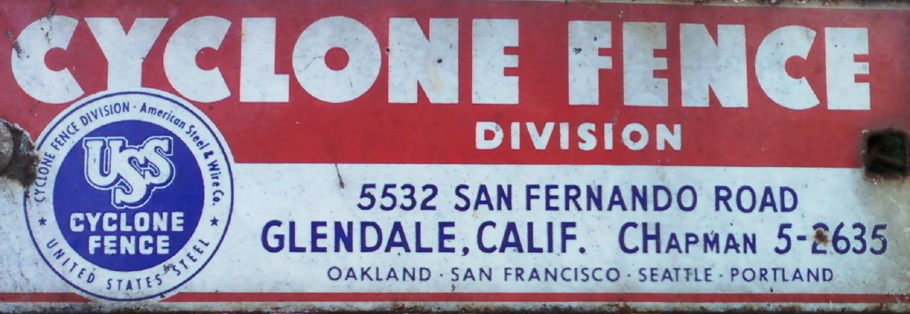
I spotted the following use of the old "2L-5N" (2 letter, 5 number) dialing instructions on a sign on a fence at Rancho Park Golf Course in Los Angeles.

The sign advertises the Cyclone Fence Division of American Steel & Wire Co.
It also mentions United States Steel. Was American Steel & Wire Co. just a part of that (USS)?
Anyway, the address given is 5532 San Fernando Road, Glendale, Calif.
And the phone number, the reason for my interest, is CHapman 5-2635.
The sign also advertises locations in Oakland, San Francisco, Seattle, and Portland.
Though the use of 2L-5N is what most caught my attention, the typography is pretty neat, too. In particular, the big fat font used for the main text of "CYCLONE FENCE."
The sign advertises the Cyclone Fence Division of American Steel & Wire Co.
It also mentions United States Steel. Was American Steel & Wire Co. just a part of that (USS)?
Anyway, the address given is 5532 San Fernando Road, Glendale, Calif.
And the phone number, the reason for my interest, is CHapman 5-2635.
The sign also advertises locations in Oakland, San Francisco, Seattle, and Portland.
Though the use of 2L-5N is what most caught my attention, the typography is pretty neat, too. In particular, the big fat font used for the main text of "CYCLONE FENCE."
16 November 2012
Digitizing your books
Here's what I've learned so far about digitizing books for personal use.
 The scanning service I've tried is called 1DollarScan. It works well. For a base price of $1 per 100 pages, they will (destructively) turn your book into a PDF. They offer various extra services, each of which costs an additional $1 per 100 pages. Some of these extras are listed below.



I've tried storing PDFs on Dropbox, Google Drive, and Scribd. I think Google Drive is the best overall. Here is a comparison of what these services offer.
Or, you can compress your documents using Acrobat's ClearScan and then they will probably fit even Google's 25 Mb limit. So far, I haven't gotten Scribd to accept ClearScan files that were bigger than 100 Mb before they were compressed, though. My guess is that when they are converted to Scribd's format, they end up being too big again.
One thing I noticed about Scribd's viewer: it doesn't show you the full resolution of your document, at least not if it is 600 dpi. I suppose you can download the PDF if this is a problem, but that might be mildly annoying.
Unlike Scribd, Google Drive allows files greater than 100 Mb. But, a PDF bigger than 25 Mb won't be searched or shown in the built-in viewer. In other words it is just an opaque (dumb) bunch of bits.
Okay so that's what I have to share about my experiences digitizing books. What follows is a postscript on the narrow issue of how to fix PDF search on 64-bit Windows.
The reason, I discovered, to my horror, is that on 64-bit Windows, PDFs won't be indexed unless you install a special "IFilter" program from Adobe. Once I did this and rebuilt the index, PDF search started working.
In my opinion, this is really bush league stuff from an otherwise major league company like Adobe. Though a little weird, I respect their choice to not have a 64-bit version of Acrobat. The 32-bit version works fine and I suppose Acrobat is unlikely to require more than the 2 Gb or so of memory that would trigger the need for a 64-bit version. But, they should have figured out how to install this 64-bit IFilter thing along with the 32-bit application, when it is being installed on a 64-bit OS.
I try not to indulge in Windows-bashing or Mac booster-ism unless I have something specific to say. So I guess I'd modify the adage
How should you scan your documents?

- 600 dpi (instead of 300 dpi)
- Ship from Amazon.com. That way you can "pretend" any book on Amazon is available as a PDF!
- OCR. I gave it a try but was not particularly impressed. So now I plan to do the OCR myself using Acrobat. Acrobat has an amazing option called "ClearScan" that replaces recognized characters with their representation in a custom font. I'm still keeping the original scans for reference, in case ClearScan messes up, but so far it has offered me about 18x compression at what appears to be an increase in quality!
- Use book title as file name. I gave it a try, and it was fine, but now I plan to just name my files using their ISBN, e.g. "ISBN 1234567890". I plan to put the title and author in the PDF metadata. This keeps file names short, though it makes them unfriendly. I'm assuming this unfriendliness won't be a problem since I'll find things by searches of content as well as file name, where the content will include the title metadata as well as the OCR data for the images. If you do go with titles in file names, note that many titles can't be exactly represented as file names since they contain characters prohibited from file names. E.g. on Windows, a colon is prohibited, but it is a very common character separating title from subtitle! As one would expect, the title field of the PDF metadata has no such restrictions.
Now, where should you put your scanned PDF?

I've tried storing PDFs on Dropbox, Google Drive, and Scribd. I think Google Drive is the best overall. Here is a comparison of what these services offer.
- Dropbox
- No file size limit
- 2 Gb overall limit for free accounts
- Offline access
- Native viewers (Acrobat, Preview)
- Native search (Windows Explorer, Mac Finder)
- Google Drive
- 25 Mb file size limit for in-browser viewer and in-browser search
- 5 Gb overall limit for free accounts
- Offline access
- Native or in-browser viewer
- Native or in-browser search
- Scribd
- 100 Mb file size limit; much smaller for ClearScan?
- No overall space limit for free accounts
- No offline access
- In-browser viewer
- In-browser search
Or, you can compress your documents using Acrobat's ClearScan and then they will probably fit even Google's 25 Mb limit. So far, I haven't gotten Scribd to accept ClearScan files that were bigger than 100 Mb before they were compressed, though. My guess is that when they are converted to Scribd's format, they end up being too big again.
One thing I noticed about Scribd's viewer: it doesn't show you the full resolution of your document, at least not if it is 600 dpi. I suppose you can download the PDF if this is a problem, but that might be mildly annoying.
Unlike Scribd, Google Drive allows files greater than 100 Mb. But, a PDF bigger than 25 Mb won't be searched or shown in the built-in viewer. In other words it is just an opaque (dumb) bunch of bits.
Okay so that's what I have to share about my experiences digitizing books. What follows is a postscript on the narrow issue of how to fix PDF search on 64-bit Windows.
Postscript: How to fix PDF search on 64-bit Windows
One of the big advantages of having your books digitized with OCR is the ability to search within a book and among all your books. To my dismay, this was not working for me on Windows.The reason, I discovered, to my horror, is that on 64-bit Windows, PDFs won't be indexed unless you install a special "IFilter" program from Adobe. Once I did this and rebuilt the index, PDF search started working.
In my opinion, this is really bush league stuff from an otherwise major league company like Adobe. Though a little weird, I respect their choice to not have a 64-bit version of Acrobat. The 32-bit version works fine and I suppose Acrobat is unlikely to require more than the 2 Gb or so of memory that would trigger the need for a 64-bit version. But, they should have figured out how to install this 64-bit IFilter thing along with the 32-bit application, when it is being installed on a 64-bit OS.
I try not to indulge in Windows-bashing or Mac booster-ism unless I have something specific to say. So I guess I'd modify the adage
If you don't have anything nice to say, don't say anything at all.to
If you don't have anything specific to say, don't say anything at all.
Here I have something specific to say. Mac's built-in PDF support is nice. You get a viewer (Preview) and search right out of the box. On Windows, it is mildly annoying that one must install a viewer (usually Acrobat Reader) on each new machine, but it is close to infuriating that indexing (search) doesn't work even when you do that install! Without some intrepid Googling to figure out that this is a 64-bit problem, you won't be able to figure out why indexing works on some machines and not others. (The answer is that some machines are running 32-bit Windows and some machines are running 64-bit Windows!)
17 October 2012
The daleth and the resh, part 1 of 2
Introduction
Here's what the Hebrew letters daleth and resh look like.
רד
With that in mind, consider the following excerpt about Isaiah 33.8.
The RSV, NRSV, NAB, and NIV follow 1QIsaa in
reading
ʾdym [‘ê·ḏîm] [עֵדִ֔ים] [concordance] “witnesses”instead of the MT ʾrym [‘ā·rîm] [עָרִ֔ים] [concordance] “cities.”“Witnesses” seems appropriate to the meaning of the passage, and the interchange of resh for daleth is understandable in light of the similarity of the letter shapes. The NJV also calls attention to this reading in a footnote. |
| Harold Scanlin, The Dead Sea Scrolls & Modern Translations of the Old Testament, p. 130 |
This got me thinking, how should one go about writing a sacred text in a way that avoids such problems?
Or, more generally, how should one go about writing a text that needs to be transmitted with high fidelity, i.e. faithfully. Sacred texts are just a specific example of this. The situation reminds me of an old FedEx slogan:
| When it Absolutely, Positively has to be there overnight. |
So, sacred texts are those where it absolutely, positively must be copied right. Yet, historically, they have fallen far short of this. At least, this is true of the sacred texts of Judaism, which are the only ones I know anything about.
The following is a rambling set of comments on the topic of faithful transmission of text. I'd like to be able to call it something more profound, like an "extended meditation," but it is really just a ramble. As the title suggests, it is the first of what I hope will be a two-part whole.
Avoid homoglyphs
The first rule of faithful transmission is "avoid homoglyphs." Well, really it should be "avoid homoglyphs and near-homoglyphs," but that isn't as catchy. Anyway, it is just a fancy way of saying "use letterforms that look different."
Hebrew homoglyphs
Hebrew is littered with near-homoglyphs. We've already seen the issue with daleth and resh; here it is again, along with various other issues.
נג כב עצ זןו רדך סםA more detailed presentation of these issues is available on the following web page. (Note that it shows Sofit and Fey Sofit in their cursive form. Their printed forms are not easily confused.)
Similar Hebrew Letters
| DIGRESSION |
By the way, this "Hebrew for Christians" site is an
example of a general pattern:
Some of the best resources for studying the Tanakh are for studying the Old Testament.Whether this is a good thing or a bad thing, or just a thing, neither good nor bad, I will perhaps opine on in another blog post. But I will remark here that it feels a little strange to me. But that feeling itself is a little strange, since when I step back and think about it, it is not surprising that it should be the case. Our sacred texts our sacred to them, too. And, while numbers don't tell all, I'll just point out that there are something like 150 times as many Christians as Jews in the world. |
English homoglyphs
Anyway, back to homoglyphs (and near-homoglyphs). To be fair to Hebrew, English is not immune to this problem. Or, rather, the Latin alphabet and Arabic digits are not immune to this problem. For example consider the following characters.
- 1 (the digit one)
- I (the letter capital I as in India) (henceforth "CI")
- l (the letter lowercase el) (henceforth "LL")
Putting all three together, you get "1 I l." How much these differ depends on whatever font is operative. For some edification and entertainment, I recommend typing "1 I l" in at one of the following sites:
flippingtypical.com
wordmark.it
| NOTATIONAL ASIDE |
I chose "India" as an example of a word starting with I since that's the choice of the NATO phonetic alphabet, which is designed to give letters different-sounding names, solving a problem analogous to the one we are discussing here. |
Are homoglyphs "wrong"?
I think we have to let sans serif fonts off easy on the CI/LL distinction. Though the distinction can be made with full strokes, not just serifs, I feel that it is not really in the charter of a sans serif font to have to make distinctions like that.
More generally, we can't say that any font is wrong if it fails to make one or more of these distinctions. Fonts serve a variety of purposes; their design goals span concerns of form, function, and the great gray area in between. Many of these goals are at odds with each other, and hence trade-offs must be made. In the service of one goal, another goal may be sacrificed, or at least compromised. For example, if simplicity of letterform is allowed to trump distinctness of letterform, then perhaps one, CI, and LL would be allowed to be very similar or even the same.
That having been said, for most purposes, distinctness of letterform is a very important goal for a font. Thus a font intended for general use should give this goal great weight in making its design trade-offs.
One and CI
My particular interest is the one/CI distinction. The most common problem here is a one that looks like CI. The above sites allowed me to quickly identify the following fonts on my computer as "offenders" in this area.
| Hoefler Text |

|
| Big Caslon |

|
A Roman-style one (henceforth "R1"), i.e. a one that looks like CI, is common as part of what are called old-style numerals or old-style figures (OSF). Such a one may be distinguishable (with effort) from CI since it is usually only x-height. Even then, when mixed with a small caps CI, the problem may persist. This might seem an obscure situation, but the use of small caps for acronyms is a somewhat common style.
Roman ones and the Great Isaiah Scroll
Let's get back to the sacred. Strangely enough, my first experience of one/CI confusion happened while reading about some famous daleth/resh confusions of more than two thousand years ago! The very perceptive reader may have noticed the opportunity for one/CI confusion in the prickly-looking abbreviation "1QIsa" that appears in my opening quote.
"1QIsa" is an interesting opportunity for confusion. On the positive side, it has a one and a CI, making slight differences between the glyphs easier to see than if they appeared independently and the reader had to find and compare far-flung examples. Also on the positive side, many readers would know, from context, that the third glyph is a CI since it begins an abbreviation for Isaiah. Slightly fewer, but still many readers would know, from context, that the glyph before the Q is supposed to represent a number.
But here begins the real problem. When the one resembles a CI, is the reader to infer that the convention is to use Roman rather than Arabic numerals? For the trivial case of the number one, it doesn't really matter, since they represent the same thing. But for the case of the number eleven, confusion could be serious, since R1 glyphs would make eleven look like the Roman numeral representation for two. And, as it turns out, there was a Cave 11 at Qumran, containing, among other things, the Great Temple Scroll (11QTa).
Let's see how the Great Isaiah Scroll is referred to in the NJPS translation of Prophets (Nevi'im) that was first published in 1978 (ISBN 0-8276-0096-8). (This is not the first publication of its translation of Isaiah; that was in 1973.)

First, we should note that the NJPS Prophets abbreviates Isaiah to just "Is" as opposed to the more standard "Isa." Perhaps that standard had not been established yet, and in any case that's not our issue here.
Our issue here is that its typesetting of "1QIs" visits the whole gamut of the one/CI/LL confusion. The one is represented
- confusingly, an R1
- incorrectly, as LL
- correctly, as an Arabic one (henceforth "A1")
The CI is represented
- incorrectly, as an LL
- correctly, as a CI
Below are scans of examples of its different settings of "1QIsa." The page numbers and the representations of one and CI are listed in the first row. Apologies that these are bilevel rather than grayscale images.
| 356: R1 / LL | 368: LL / CI | 369: R1 / CI | 468: A1 / CI |
 |
 |
 |
 |
This was all fixed, to A1/CI, in the 1985 NJPS Tanakh. More generally, the 1985 Tanakh moved to using A1 rather than R1 in footnotes.
And then came the digital age.
What promise it offered, and continues to offer! Yet, what typographic barbarisms it has facilitated. I suppose that only from great heights can great falls happen. Another way I've seen it well-put is:
| To err is human; to really screw things up requires a computer. |
Don't get me wrong, my Kindle version of the NJPS Tanakh is one of my prized possessions, inasmuch as something so intangible can be thought of as a possession. But somehow one/CI confusion in "1QIs" crept back in, with a vengeance. In particular, the one is usually represented as a CI.
Below are scans of examples of its different settings of "1QIsa." The Kindle locations, Kindle and printed page numbers, and the representations of one and CI are listed in the first row.
| 16293 / 762 / 633: CI / CI | 16330 / 762 / 640: A1 / CI |

|

|
| DIGRESSION | In typical great heights/great falls fashion, Kindle locations offer citations of intriguingly high resolution, but all footnotes have been converted to endnotes, and thus all Isaiah footnotes appear to be on the last page of Isaiah, 762. Within the hyper-linked Kindle world, this doesn't really matter. For citations that "work" for the printed version, you need to follow the endnote's hyperlink "backward" to find the real page. |
In the Kindle edition, how can we know whether the one is being represented by a CI or an R1? Well, for one thing it is visually identical to other CI glyphs, but, more deeply, if you copy and paste it, it is a CI; and if you search for IQI (CI-Q-CI), you'll find those instances that use it.
An important consequence of this is that if you search for 1QI (one-Q-CI), you won't find the IQI (CI-Q-CI) instances. And here we really find form spilling over into function. So far all my complaints about the typesetting of "1QIs" could be dismissed as the whinings of an aesthete with too much time on his hands. I would mostly disagree with this characterization, but would have to admit that function was only impaired, not destroyed by these problems. If we narrowly define function as transmitting the meaning, "Isaiah manuscript from Cave 1 at Qumran," then these problems probably did not destroy function for most readers. They probably just made it more difficult to decode this meaning, i.e. they only impaired function.
But the digital version adds (or should add) a new function: the ability to search. And this was not just impaired but destroyed by the misrepresentation of one as CI.
| DIGRESSION | When one is represented as one in the Kindle edition, it shows up as an Arabic, yet old-style, figure. This and other research leads me to believe that Georgia is the font used by the Kindle Reader for Mac. Or at least it is the font used when a serif, proportional font is requested. Note that you can't easily change fonts on any Kindle-reading platform. That's why I said it is "the font," not "the default font." On Kindle hardware, the font seems to be PMN Caecilia, which has a lining one, i.e. a non-old-style one. Some fonts may have an option for both lining and old-style figures, and perhaps even an option for both an Arabic and Roman old-style figure for 1. I'm not sure if either of these fonts do, but the relevant question here is what does their default one look like. |
Conclusions
If you have the luxury of making up your own alphabet, avoid homoglyphs. This luxury is rarely available; the only recent example I can think of is the invention of the Klingon alphabet. I wonder how distinguishable its glyphs are.
| DIGRESSION | Another "I wonder ..." about a recent example: did anything analogous to daleth/resh confusion ever happen with the Book of Mormon? |
Back to obvious conclusions: if you, like most of us, are stuck using someone else's alphabet, choose your fonts so as to avoid homoglyphs. For example, avoid fonts with Roman ones if the text you're setting might use them in a way that would cause confusion. Perhaps you don't need to avoid the font altogether if it provides an Arabic one as an alternative.
Finally, let's zoom out to a theological question: if Isaiah's words are holy, why didn't G-d give him a better alphabet to record them in?
My suggestion is, the Hebrew alphabet is no more the alphabet of G-d than the Hebrew language is the language of G-d. Indeed problems like daleth/resh confusion serve a useful purpose. They remind us that we are reading holy words, not G-d's words. Holy words bring us closer to G-d, but they are written in man's imperfect alphabets, and in man's imperfect languages.
To me, the very notion of "G-d's words" unacceptably diminishes G-d by seeing him as acting within the limits of language and therefore possibly constrained by language.
Like anyone else (perhaps more so), I can't claim to know much about G-d. But I'm pretty sure he is without limits. (So I'm also pretty sure he is not a "he" or a "she"!) And I'm pretty sure that if G-d had an alphabet, we surely could not read it.
11 October 2012
More on Qumran, Isaiah, and the NJPS
Introduction
This post is another follow-up to my post, "Qumran, Isaiah, and the NJPS," covering some possible unnoted Qumran influences.
In my earlier post, I said
It is possible that the Qumran influenced the NJPS Isaiah in ways that were not noted, but that is more difficult or even impossible to know.
But it occurred to me later that I might be able to find some unnoted influences by looking at verses where other translations were influenced. In particular, I might be able to find some unnoted influences by looking at all verses mentioned in Scanlin, since his coverage of the NJPS (which he calls the NJV) is not exhaustive.
Doing this, indeed I did discover at least one unnoted influence, but I also discovered some other things of interest in these verses, which I allowed myself to digress into.
Executive summary
The only verse in which I'm pretty sure there is an unnoted Qumran influence is 8.2. Possible influences include 19.18, 45.2, and 45.8. Things of non-Qumran interest show up in 14.30 and 33.8.
The Details
Isaiah 8.2
The NJPS appears to be using the imperative form of 1QIsa-a without note.
| NJPS page 632 |
[[8.1] The LORD said to me, “Get yourself a large sheet and write on it in common script ‘For Maher-shalal-hash-baz’;] and call reliable witnesses, the priest Uriah and Zechariah son of Jeberechiah, to witness for Me.” |
| [no footnotes relevant to the issue at hand] |
Here's what Scanlin has to say about it (p. 127).
The MT and 4QIsa-e have a first person future verb for "I will call as witness(es)," [wə·’ā·‘î·ḏāh] [וְאָעִ֣ידָה] [concordance] while 1QIsa-a reads wh`d, an imperative form, "and have it attested," as in NRSV. The NIV translates the MT (with 4QIsa-e), "And I will call in Uriah the priest and Zechariah ... as reliable witnesses for me." Some translations translate the consonants of the MT, but change the vowel of the first letter from we [wə] [וְ] to wa, [wā] [וָ] changing it to the past tense [concordance]. The future tense of the NIV, however, is a legitimate tense shift in prophetic literature, reflecting the prophet's certainty that he will be the agent of God's message. In any case, it does not seem necessary to resort to the 1QIsa-a reading.
Isaiah 14.30
Here the NJPS is not influenced by Qumran, in that it chooses "it will slay" instead of "I will slay." But, in a footnote, it offers an emendation of unspecified source.
| NJPS page 648 |
[[14.29] Rejoice not, all Philistia, Because the staff of him that beat you is broken. For from the stock of a snake there sprouts an asp, A flying seraph branches out from it.] The first-born of the poor shall graze And the destitute lie down secure. I will kill your stock by famine, And it shall slay the very last of you. |
| [footnote:] Emendation yields “It shall kill your offspring with its venom (zar‘ekh berosho) [zar‘ekh: זַרְעֵ֑ךְ concordance.] [berosho: ?].” |
Here's what Scanlin has to say about it (p. 128).
The RSV and NRSV follow 1QIsa-a in translating, "I will slay," instead of "he/it will slay." The Isaiah scroll seems to better fit the context in which this passage is preceded by another first person singular verb. Among the ancient versions, only the Latin agrees with 1QIsa-a. Burrows finds the Qumran reading quite convincing (1955:307), and the NEB/REB concur. However, HOTTP prefers the MT, explaining the shift to third person as a reference back to "the venomous serpent" of 14:29.
Primarily, the emendation in the NJPS note substitutes offspring for stock and venom for famine. But, secondarily, the emendation would bring the last two lines into "person agreement." I.e. it would read
It shall kill [...]It is perhaps interesting to note that the 1QIsa-a variant also has such "person agreement," albeit in the opposite direction (changing both lines to first person), i.e.
And it shall slay [...]
I will kill [...]
I will slay [...]
Isaiah 19.18
It is unclear whether one or more of the "many Hebrew manuscripts" referred to in the footnote is from Qumran. I.e. there is some Masoretic as well as Qumran support for "Sun City."
| NJPS page 656 |
In that day, there shall be several towns in the land of Egypt speaking the language of Canaan and swearing loyalty to the LORD of Hosts; one shall be called Town of Heres. |
| [footnote:] Meaning uncertain. Many Heb. mss. read ḥeres, [חֶרֶס] “sun,” which may refer to Heliopolis, i.e., Sun City, in Egypt. Targum’s “Beth Shemesh” (cf. Jer. 43.13) has the same meaning. |
Here's what Scanlin has to say about it (p. 129).
In a note, NIV cites Q (= Qumran) along with some MSS of the MT in support of the reading "City of the Sun." Other versions, including RSV and NRSV, read "City of the Sun" in the text without adding a textual note. This follows the general practice of many translations that do not cite textual variants if there is any manuscript support in the Masoretic tradition.
In the body text, the NJPS has chosen to transliterate rather than translate "Heres," whereas most Bibles choose to translate, either to "destruction" (from הֶ֫רֶס) (concordance) or “sun” (from חֶרֶס). It is slightly surprising that the NJPS does not note the possibility of "destruction."
Isaiah 33.8
I mentioned this verse in my original post but bring it up again here because the note is odd. It is odd because the alternative that 1QIsa-a offers for "cities" is usually understood to be "witnesses," not "a pact."
| NJPS page 685 |
Highways are desolate, Wayfarers have ceased. A covenant has been renounced, Cities rejected Mortal man despised. |
| [footnote:] 1QIs-a reads “A pact.” |
Here's what Scanlin has to say about it (p. 130).
The RSV, NRSV, NAB, and NIV follow 1QIsa-a in reading ʾdym [‘ê·ḏîm] [עֵדִ֔ים] [concordance] “witnesses” instead of the MT ʾrym [‘ā·rîm] [עָרִ֔ים] [concordance] “cities.” “Witnesses” seems appropriate to the meaning of the passage, and the interchange of resh for daleth is understandable in light of the similarity of the letter shapes. The NJV also calls attention to this reading in a footnote.
Isaiah 45.2
Here the NJPS implicitly disavows Qumran influence, in that the note says that the meaning of the Hebrew is uncertain, and only the meaning of the MT Hebrew is uncertain. Yet, the NJPS chooses "hills," which is close to the "mountains" of 1QIsa-a.
| NJPS page 714 |
I will march before you And level the hills that loom up; I will shatter doors of bronze And cut down iron bars. |
| [footnote:] Meaning of Heb. uncertain. |
Here's what Scanlin has to say about it (p. 130).
The second line in the MT reads, "I will level the swellings/rough places." The Hebrew word rendered "swellings" [wa·hă·ḏū·rîm] [וַהֲדוּרִ֖ים] [concordance] occurs only here in the OT. 1QIsa-a reads hrrym "mountains," which is followed by the NIV, NAB, and RSV/NRSV.
Isaiah 45.8
The NJPS notes no Qumran influence, yet its use of "sprout" instead of something like "be brought forth" is the kind of thing one would expect from Qumran influence.
| NJPS page 714 |
Pour down, O skies, from above! Let the heavens rain down victory! Let the earth open up and triumph sprout, Yes, let vindication spring up: I the LORD have created it. |
| [no footnote] |
Here's what Scanlin has to say about it (p. 130).
The RSV and NRSV follow the 1QIsa-a reading wyprch [ויפרח] for the MT wyprw, [ויפרו concordance] a difference of only one letter, cheth [ח] for waw, [ו] which yields the translation, "that salvation may sprout forth [RSV]/spring up [NRSV]," instead of "that they may bring forth salvation." The NAB follows the same Qumran reading. The NEB and GNB, in dynamic equivalent renderings, demonstrate that both the MT and Qumran express a common idea. The NEB translates, "that it may bear the fruit of salvation," and the GNB has "[it] will blossom with freedom and justice." Neither translation has a textual note here. HOTTP prefers the Qumran reading, but as can be seen, there may be little difference in the translation of the MT or Qumran.
To me, the most notable thing has nothing to do with Qumran, but rather that translations that are part of Christian Bibles seem to universally use "salvation" where the NJPS uses "triumph." Whether it is brought forth or sprouts seems secondary.
This is just speculation, but I wonder if what we're seeing here is a case of harmonization of Isaiah with Christian ideas. Or, on the other hand, a reluctance on the part of the NJPS to use a word like "salvation" that has such strong Christian resonances.
For what it's worth, the NJPS does not shy away from using the word "salvation," for instance in the following four verses of Isaiah.
| 49.6 |
For He has said: “It is too little that you should be My servant In that I raise up the tribes of Jacob And restore the survivors of Israel: I will also make you a light of nations, That My salvation may reach the ends of the earth.” |
| 49.8 |
Thus said the LORD: In an hour of favor I answer you, And on a day of salvation I help you— I created you and appointed you a covenant people— Restoring the land, Allotting anew the desolate holdings, |
| 51.8 |
For the moth shall eat them up like a garment, The worm shall eat them up like wool. But My triumph shall endure forever, My salvation through all the ages. |
| 56.1 |
Thus said the LORD: Observe what is right and do what is just; For soon My salvation shall come, And my deliverance be revealed. |
Here's a possible explanation for the use of "salvation" in the verses above as opposed to its non-use in 45:8. In the verses above, "salvation" is being used as the translation of words rooted in יְשׁוּעָה (yeshuah) (concordance), whereas in 45:8, the word is rooted in יֵ֫שַׁע (yesha) (concordance).
Conclusion
The only verse in which I'm pretty sure there is an unnoted Qumran influence is 8.2. I discovered some other interesting stuff along the way, though.
Postscript
I was excited to learn that Scanlin is available in electronic form through Logos Bible Software.
Subscribe to:
Posts (Atom)